


ROMO The WolfBoy - Production Blog 4
Everybody Loves A Parade... Right?

Exhaustion: Easter hols: concentrating on trying to get myself an agent for any of this: plus taking into account sundry other minor duties and inconveniences of late (doing my non-existent accounts!) has created a series of artificially short weeks… Sometimes, and particularly of late, there just doesn’t seem to be enough time to fit in all in.
Compounding these stresses around regular scheduling, a number of recent sequences (intended to be posted here fresh each and every week, mind) have proven to be some of the most intense and complicated scenes that I’ve crafted so far… and, sometimes, something’s gotta give. And this week that something is me.
SO: No new pages of ROMO this week, for which, my profuse apologies.
Instead we fill in with another Production Blog, which ironically, going by what I see happening elsewhere around the intersnot, often shows itself to be the more popular choice anyhow - a peek behind the curtain, along with tidbits of backstage gossip.
So let’s talk - REWRITES!
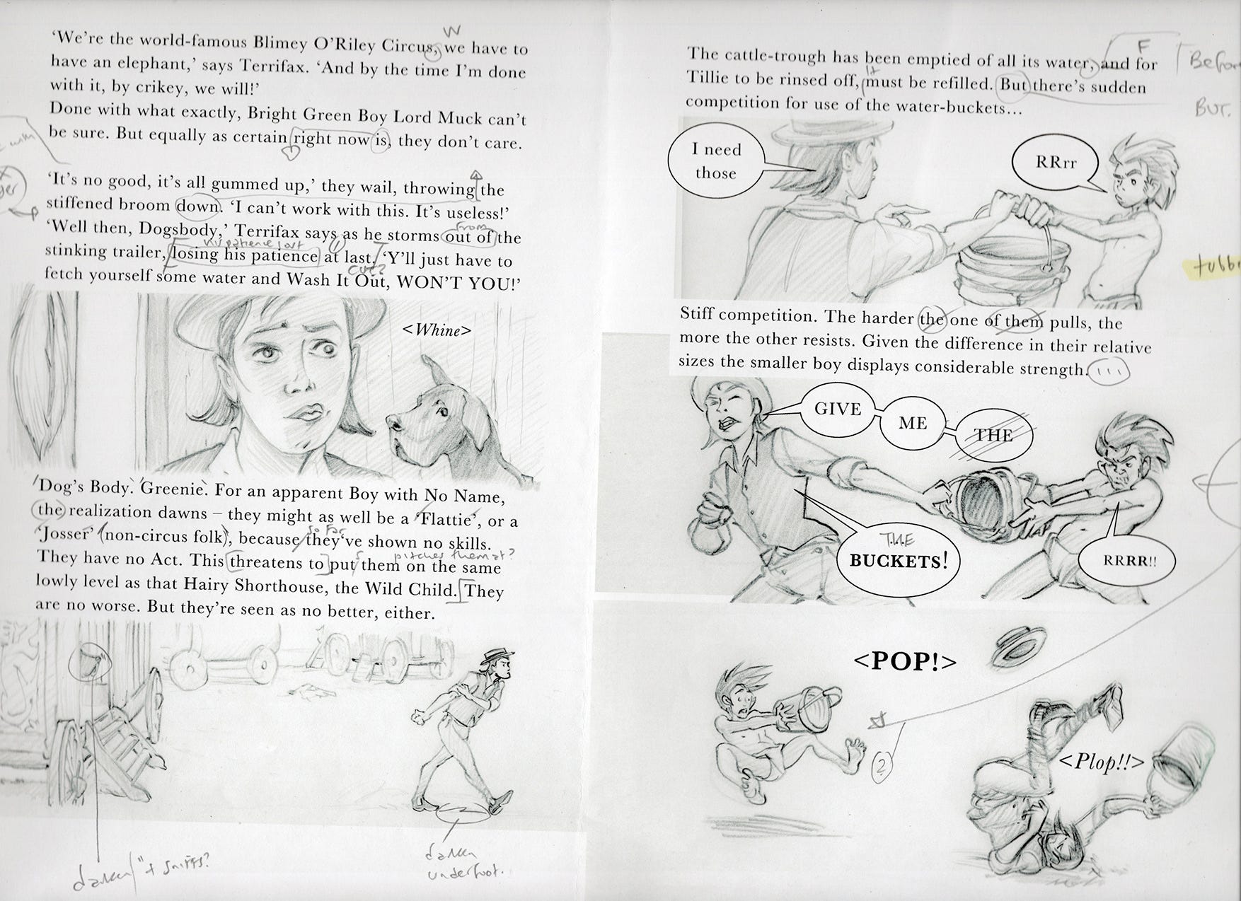
(Scan’s a bit Wonky Woo, sorry about that.) Here’s a draft that I made (and actually small press published) earlier… and an indication of just some of the later textual and image-based revisions that I made to it before it became the version you see here now (as pages 044-045).
Yeah, it’s a LOT.
You might think this stuff just pours straight out fully envisioned. And when things are flowing right, it pretty much does. But there can be ‘many a slip twixt the cup and the lip’ - and, well, sometimes you just get porridge dribbling all down your front.
The changes in wording here speak for themselves. I tend to composit the text directly onto the page layouts - as I am doing right now with this right here - and it can become an awkward if not treacherous distraction to the art of fine writing when you end up concentrating more on trying to copyfit, than on making concise and clear sense. For one thing I hate what’re called ‘widow and orphans’, like the word ‘sense’ just there. Hm, and now ‘just there’, if I leave it that way. I’d better stop now
Here’s a weird one…
Giggle, and indeed, Hide. The computer made this weirdness all by itself. I’m kind of hoping that it doesn’t mean my screen is about to up and die on me at any point… but it might! Erk
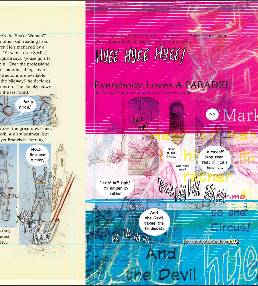
Talking of colour, if nothing quite so psychedelic, you’ll notice on my first visual example above that the original scanned drawings were monotone, in black and white. A bug had gotten into my head that I should aim to make this, my prospective new venture, as cheap as possible a proposition, since rising print and production costs seemed to be contributing to publishers becoming increasingly reluctant to commit.
But then word came down from somewhere on high that anything ‘black and white’ wasn’t getting commissioned. So in my next iteration (the one I self-published in a grant-assisted small press pilot edition: thanks Lakes International Comic Art Festival) I converted everything to sepia tones and turned the ‘white’ paper a faux yellow tint. Then (sigh) word came down that ‘sepia’s a cliché’…
… some lifetimes you just can’t win.
A FUNNY THING HAPPENED ON THE WAY TO THE CIRCUS
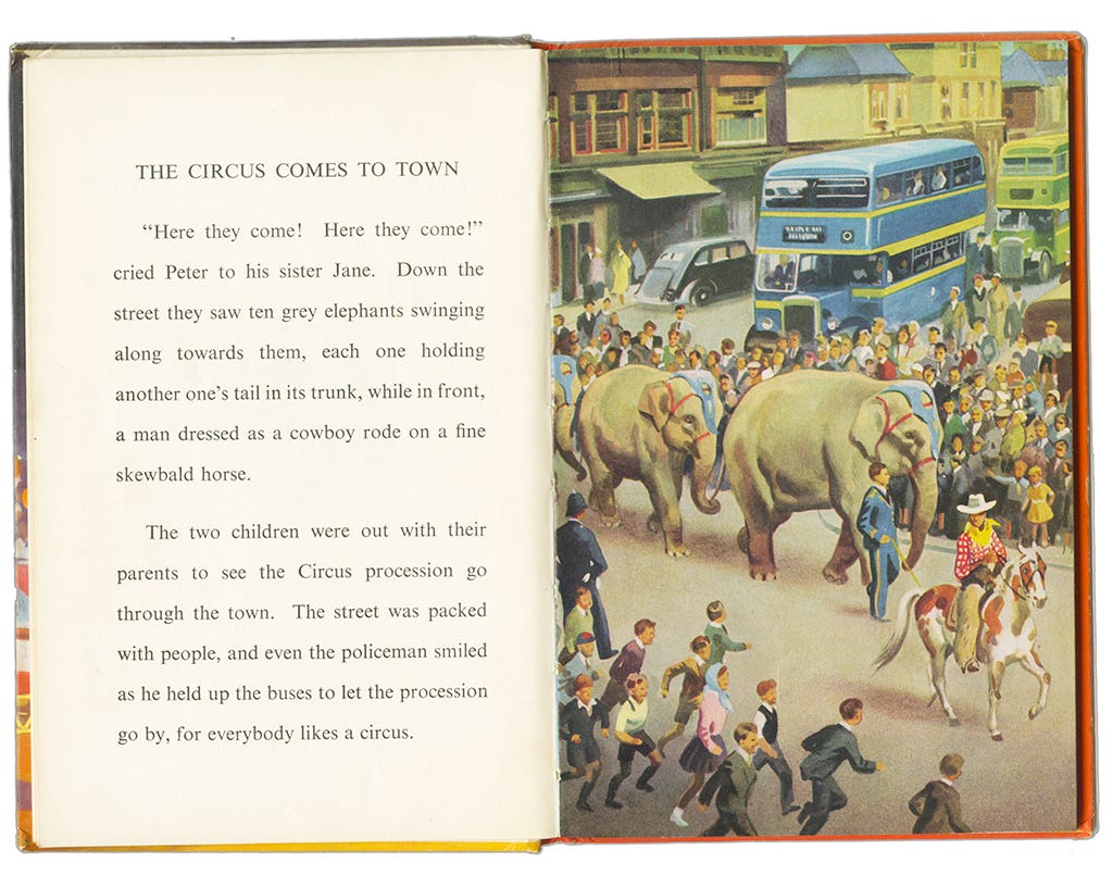
Look again at pages 068-069, from about four weeks back, and you might recognise and be able to spot some of the little running figures there, from this painted image. It’s by John T. Kenney and dates back to first publication in 1957. I wasn’t even born!
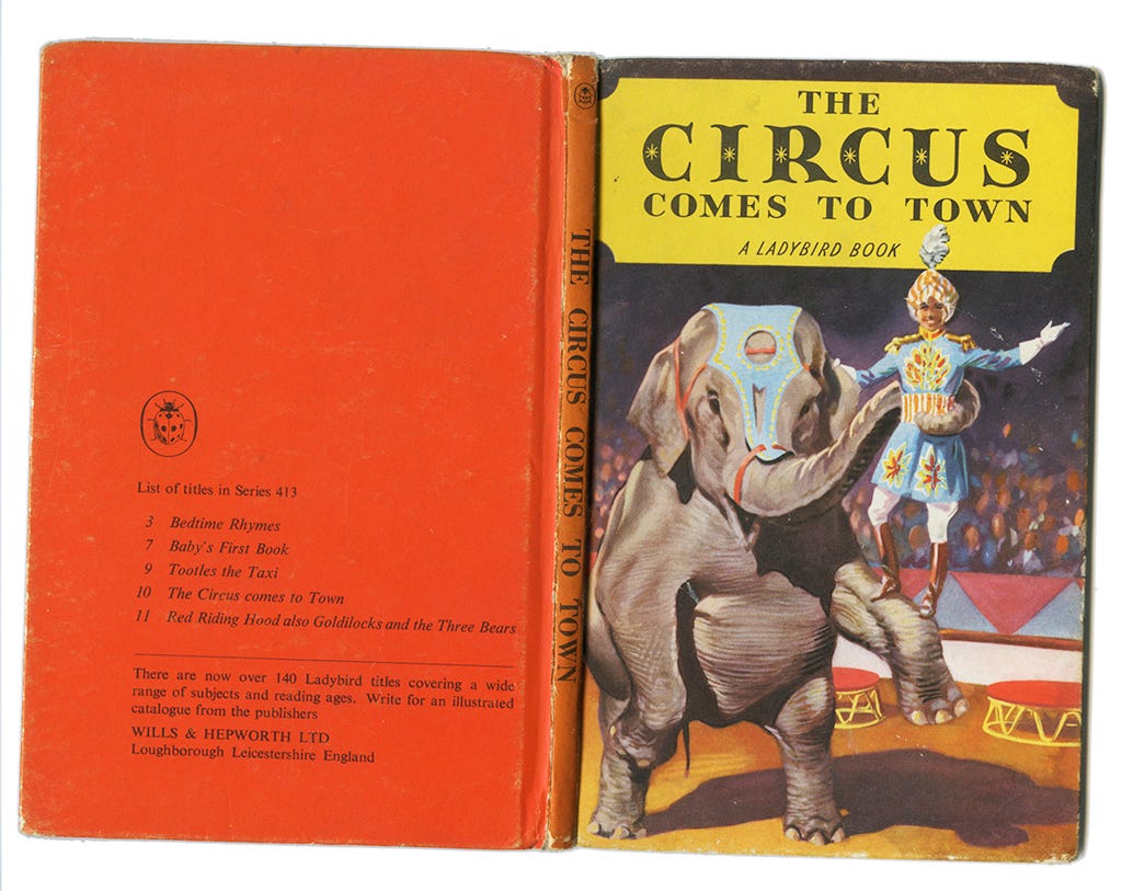
Here’s the cover to that same book (Wonky Woo strikes again, but not my fault this time - this here scan comes to you courtesy of my old mucker and sometime employer Philip Boys and his wonderful blog postings at www.historyofwandsworthcommon.org
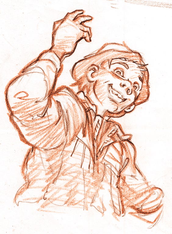
My edition has long since lost its dust cover version of the above illustration. But look, who’s that?! Why, it’s none other than Terrifax the Lion Tamer (with, errr, 'Jumbo’)! The look Terry wears when in performance mode comes directly from here.
Where else have I stolen, er, taken inspiration from, you ask?
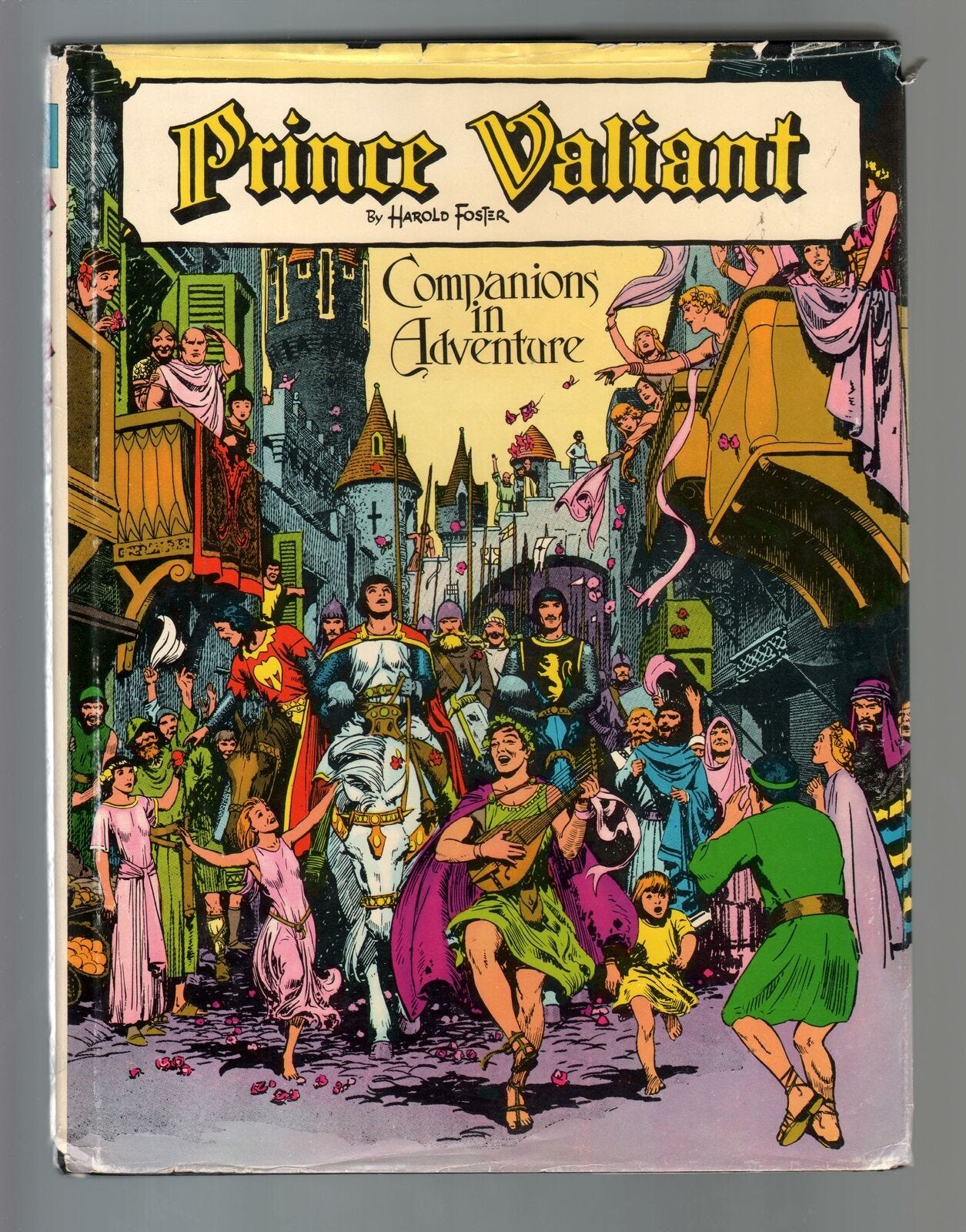
Exhibit B: I refer you, M’lud, M’lady (sorry, Spike) to Harold Foster’s Prince Valiant, and a book cover from a compilation of this most famous of all syndicated newspaper strips first published in 1956. And then look at my own page 071 and pronounce me ‘GUILTY!’. But let me first plead leniency on the grounds that my image is an homage.
This too:
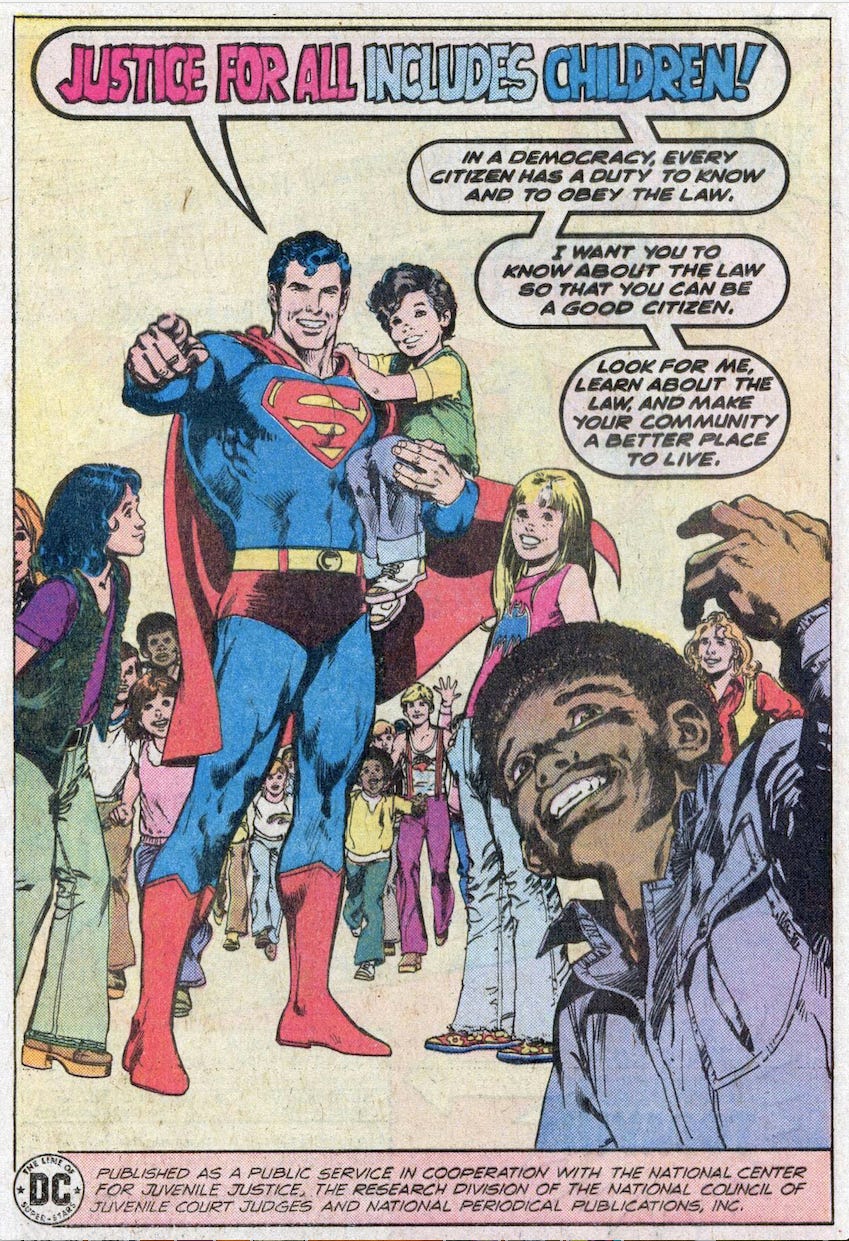
“Didn’t see that one coming, did you?”
He’s on page 068. And JUSTICE FOR ALL includes me and my homage images. I did that freehand by the way, there was no tracing going on. But I’m a machine! You copy?
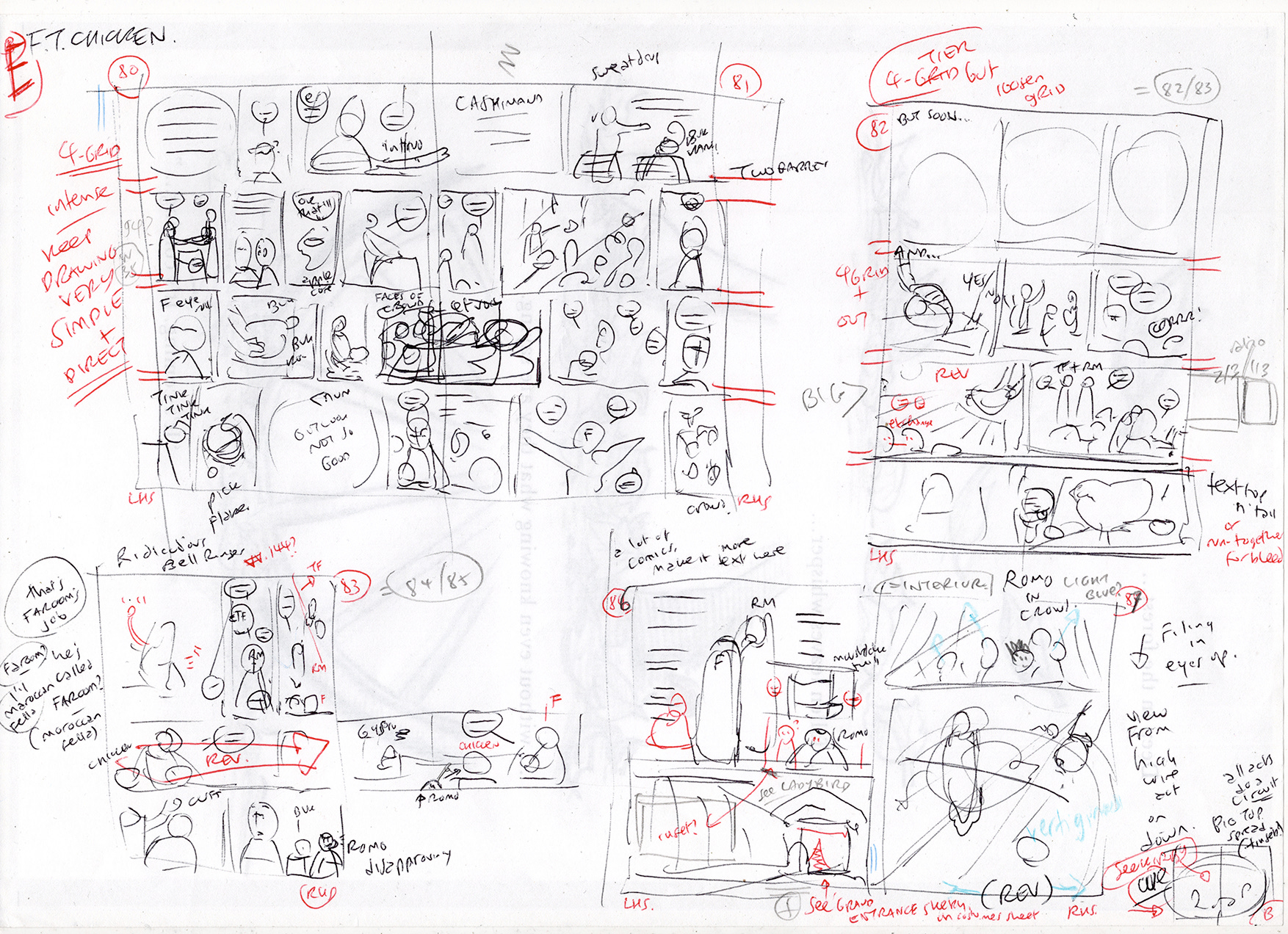
The intensity of the parade sequences was hard to live down. It carried straight on into the midway by night, and the debut of Francis’s Mystic Chicken (pages 080-81), a DPS or Double Page Spread as seen above in thumbnail form, top page left.
Trouble is, last week this madness almost capsized me. The extra detail I’ve been putting in not only strings me out week on week, it’s been getting way from what my over-arching aim with this strip was meant to be in the first place - an All Ages clarity, besides the hilarity and the entertainment value of it. I needed to simplify!
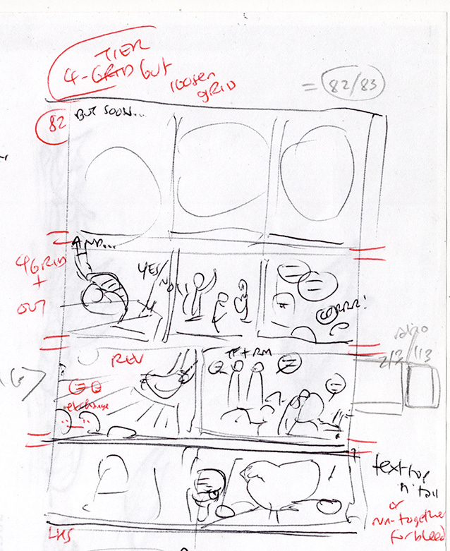
This became even more apparent when it came time to letter the page layouts for what were to be pages 082 (above) and 083 (below):
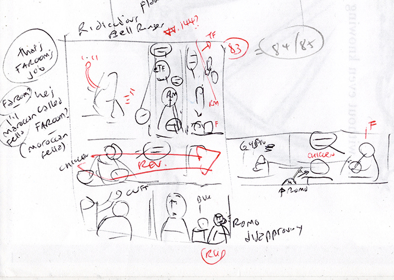
Once all of the draft text captions and even moreso the speech balloons were on them, I found that there was almost no room left for the images! I’d lost sight of what it was I was meant to be crafting here. And that meant I had to redraft my thumbnail layouts for those same two pages (082-083), converting this same sequence here into the eventual four pages it has since become (082-085, posted just last week!). And… relax.
(Look closely at the whole page scan of original thumbnails 3 images back and you can see, bottom-most middle to left, a hint of What’s Coming Next, on pages 086-087, which I haven’t even begun to draw yet!
These layouts will, I think though, stay pretty much the same. So don’t peek.)
And that’s quite enough for now. Even though Everybody Loves a Parade, Right?
Right?!
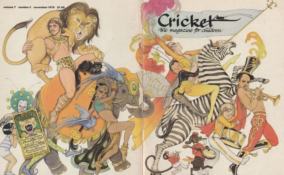
Cover to Cricket magazine by Hilary Knight, from November 1979. Among my inspirations, certainly, but not an image I’ve homaged directly - at least, not yet!
Hm, looking at it again here now the strong influence of the illustration stylings of Janet and Anne Grahame Johnstone seems clear. Their own seminal works have, in turn, I believe been a huge HUGE influence on the tropes of shoujo (‘pretty girl’) manga as we know it today, and ever since the 1950s - the elongated limbs, etc.
Image / homage. What goes around comes around I guess. Over and out! X
Fascinating seeing an insight into your process and realising just how much work goes in! Wow 😮 Such a talent.
speech balloons/picture plane...
Should I understand from that request that you don't like the way they look? (I don't wish to presume, but a couple of other people didn't favour that from an earlier iteration and said so.) Personally I believe the white helps lead the eye around the page. I'm trying to cater to new audiences and not just those who are used to comics. Clarity is my watchword.
I wouldn't necessarily apply anything universally, though. Every story is different.