Lakes International Comic Art Festival, that is - or LICAF (hairball!)
Taking place this weekend at Lake Windemere, where it is indeed most often windy, and rainy. Both. At the same time. And most of the time spent there we’ll be staying in a tent! But marquee-sized, as it is an International Rights Tent. And when not in that tent we’ll be holding court in the tent right next door, the Lakeview Marketplace 2024.
Lucky Table 14 (that’s been my house or flat number more than once in this lifetime, and is a mainstay of my Lottery picks). Er, unluckily, tucked behind the door when it opens, by the looks of the seating map there. Ee, s’like being a wedding, innit. A wedding with signings. And a bookshop. And have you seen the state of the groom?!
We’ll be doing our best to sell ourselves to some forward-thinking publisher or other.
A lot may hinge on what level of reception or success we get there… Wish us luck! (!)
Last week’s pages didn’t quite come out the way I’d originally planned for them to do so. That’s often the way, but this time they really strayed off course in the heat of the creative moment. As I have perhaps shown before, I was hoping to catch the flavour and feel of an action sequence from a vintage comic or two, such as this one:
Or this one:
(Those with longer memories, like that of our stand-in Circus Elephant, aka Betsy the farmer Old MacDonald’s prize cow, may well recall something sort of akin to the above water-pump mishaps having already happened between our Romo and Francis, in a much earlier scene.)
I love the quality of the newsprint orange there, one that displays OK on the RGB of a monitor screen, but would be almost impossible to get with modern-day CMYK print.
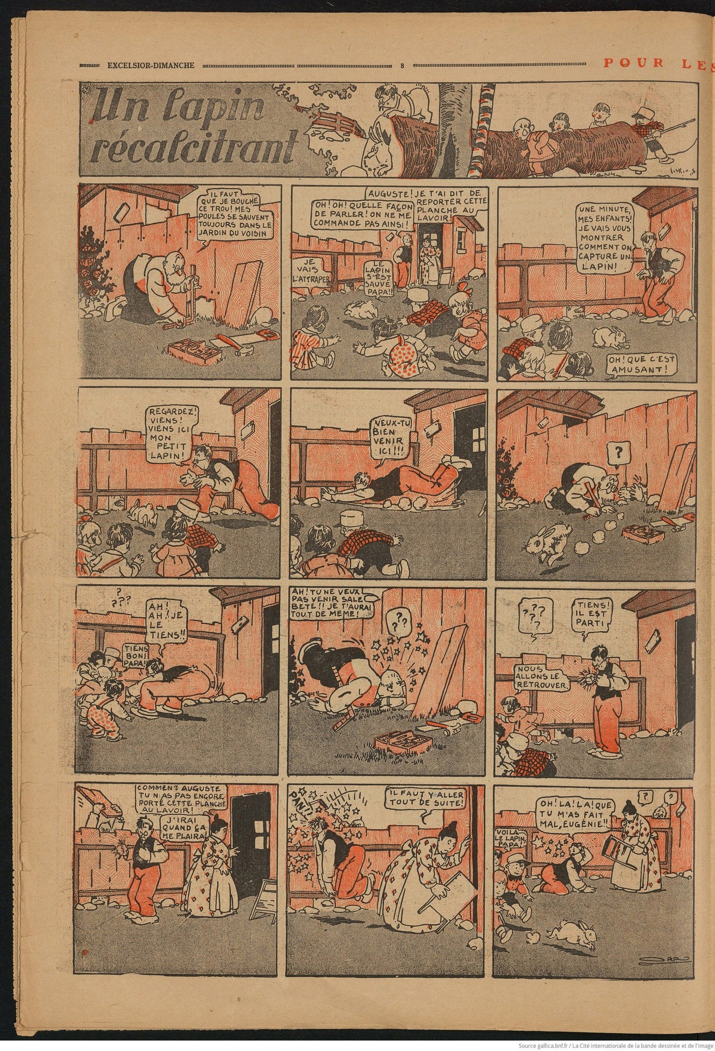
Of all of the sample images of slapstick scenes from proper vintage comics I had saved and set aside, it’s the following that has, at length, proved my very favourite:
Again, a nice orangey-red second colour to inspire and aim to mimic as close as I could. You will see other elements that I took if you compare them alongside pages from last week’s posting, such as the dizzying stars, and even one of the postures struck.
What seemed characteristic was the thin line panel borders (conspicuously absent almost throughout pages of ROMO). But, in the event, I failed to accommodate my planned action within repeat panels of the exact same dimension - and without those my original scheme for this sequence swiftly fell away. A failed experiment, then. A least so far as that sort of veracity or else resemblance to old comic strips went.
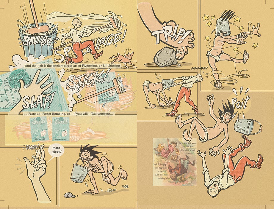
One other thing that I’d always meant to do here - and remembered to do only after I had already posted the pages on Substack, was to again mimic old print by putting at least some of the additional ‘second colour’ effects out of register. That’s been fixed on the original master files now, and that’s how those pages will properly appear in any printed book. And hopefully, some level of success at the Lakes Festival this week might help get us closer than ever before to that lofty goal! Fingers and toes crossed.
The latest (later than last week’s) version of a spread with the coloured layer now misregistered Nyeeeh - close, but not worthy of a cigar. How many would now get the reference anyway?!
There’s a callback therein too to a very old strip of mine, one that originally appeared through the auspices of Marvel UK. A spot prize goes to anybody who can name it…
All of the above by way of some little apology. Since I have to stick my colours to the mast and do my damnedest to sell this thing over the weekend, I’m afraid that’s yer lot for another week now. I hope that the bumper crop of 6 pages posted last week, beside this peek behind the lacy curtain, will keep everyone sweet as pie until next time.
Otherwise, I guess, "Pay no attention to the man behind the curtain". Er… Over. X
Because, because, because, because…


