
ROMO 2, Week 9
Beginning to get the hang of Procreation… I think!

Hello
Going to keep this one short and sweet. I type these things out and assemble them on a sizeable desktop computer - my preference and default. I'm too old for flipping phones! But last week I noticed how LONG my texts appear when viewed on a phone: which is how, I would surmise, most of you are probably seeing these.
So, while this here site (Substack) is a thing started by journalists for journalism, my aim from now on (unless I hear any votes different) is to be more succinct!
I promised you ‘PROCESS’, and here it is…
Remember a bunch of weeks back when I showed you my first stabs at digital drawing using the programme Procreate on a brand new iPad…? Looked like this…
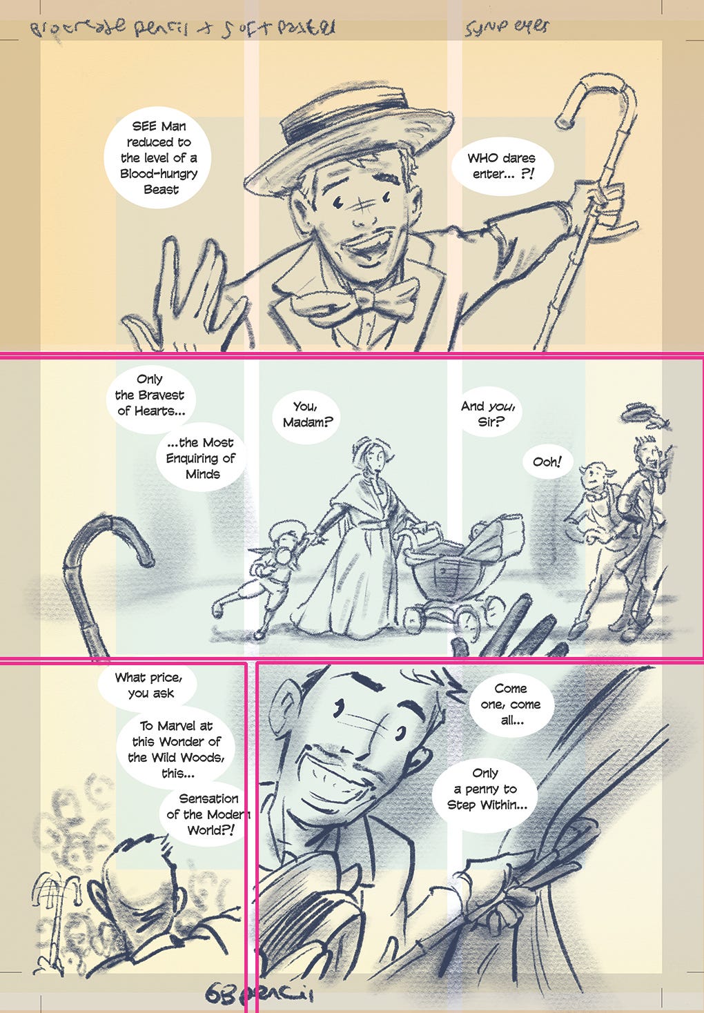
Well, except for since then, I added test lettering (at a marginally smaller font size and leading than that used in the printed Book One), and it seems to work just fine.
Note how all of the lettering is gathered within the innermost blue area central to the page layout template - this is the ‘safe area’ - away from risk of being cropped away from any full bleed page (the grey area surrounding the page does not appear in print), or disappearing down the central margin of any bound book, whether this is left- or a right-hand page.
That requirement, for all text to occupy the ‘safe area’, affects my panel layouts quite considerably. It is a ‘control’, as it were. I’m checking it works here by adding the lettering on now - although, ultimately, I will otherwise be attending to all of that much later.
I added in the pink lines here just now to show you how the panel structure goes - top two tiers are full width single images (‘panoramic’). The bottom tier conforms to the underlying 9-panel grid with a single followed by a double. Ooh, brevity, brevity…
So as of today it looks more like this (minus the lettering which I have checked)…
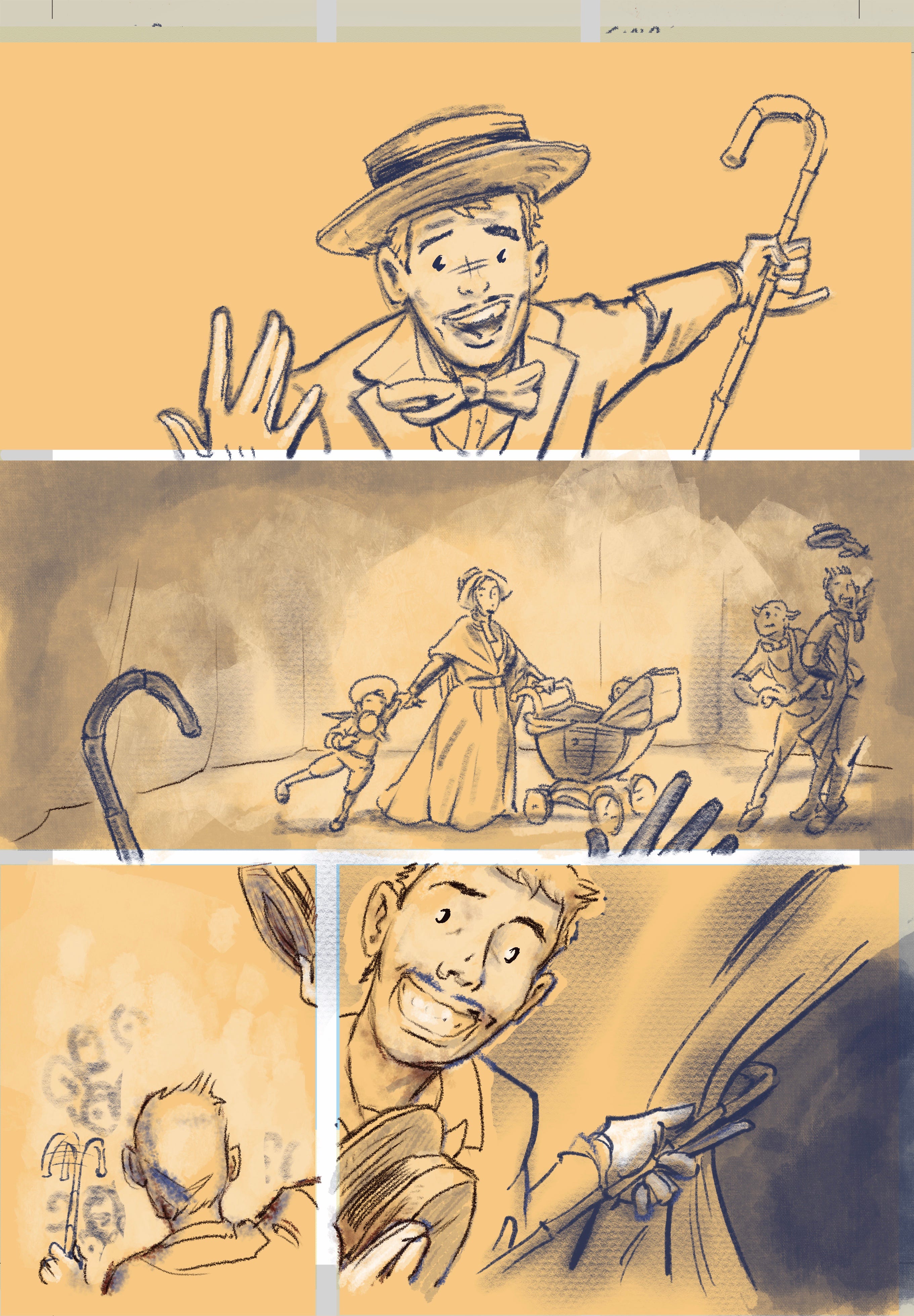
Some bits the same, some different, as I try and refine my working process. This is slow going, and hard, because the decisions I make now will last throughout the first 24 pages - a single, uninterrupted opening scene within the same location.
What pencils, what brush, what colours (shade AND lighting), and so on. There have been a fair few attempts at trial and error and in among this page’s many layers some of those ghosts yet persist. But, you know, it begins to LOOK like a comic page. No?
We’ll skip a page. I’m still wrestling with that next one.
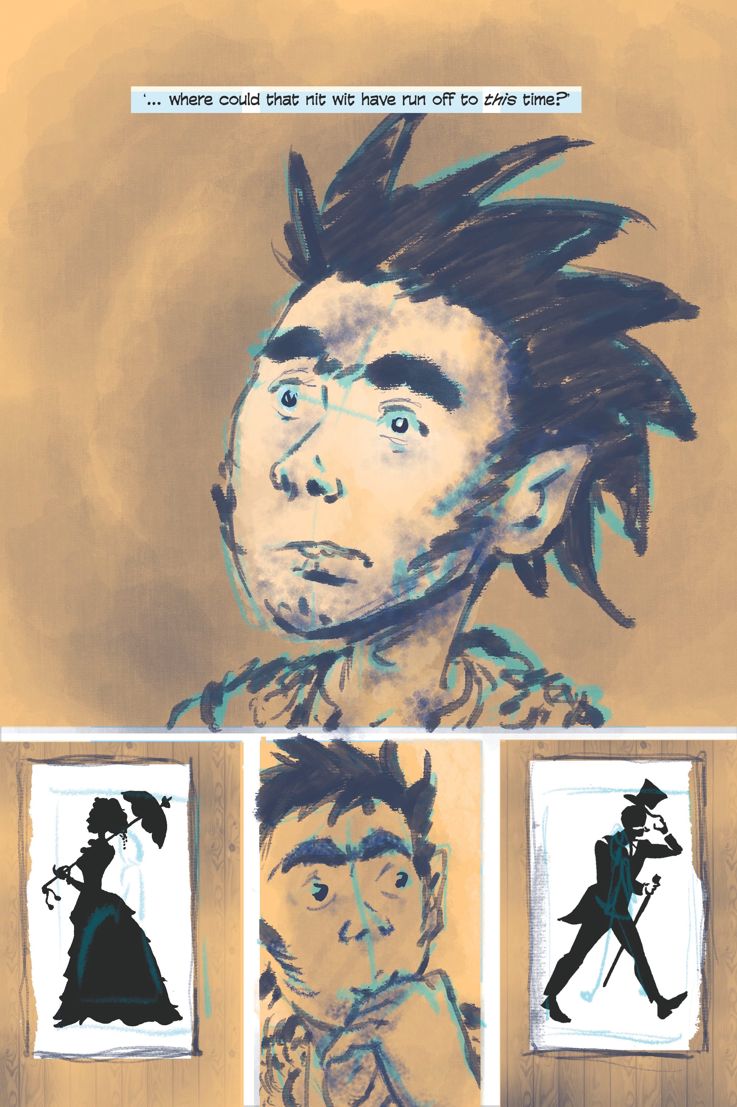
Here below is the next one after that, and ROMO’s debut within this second adventure:
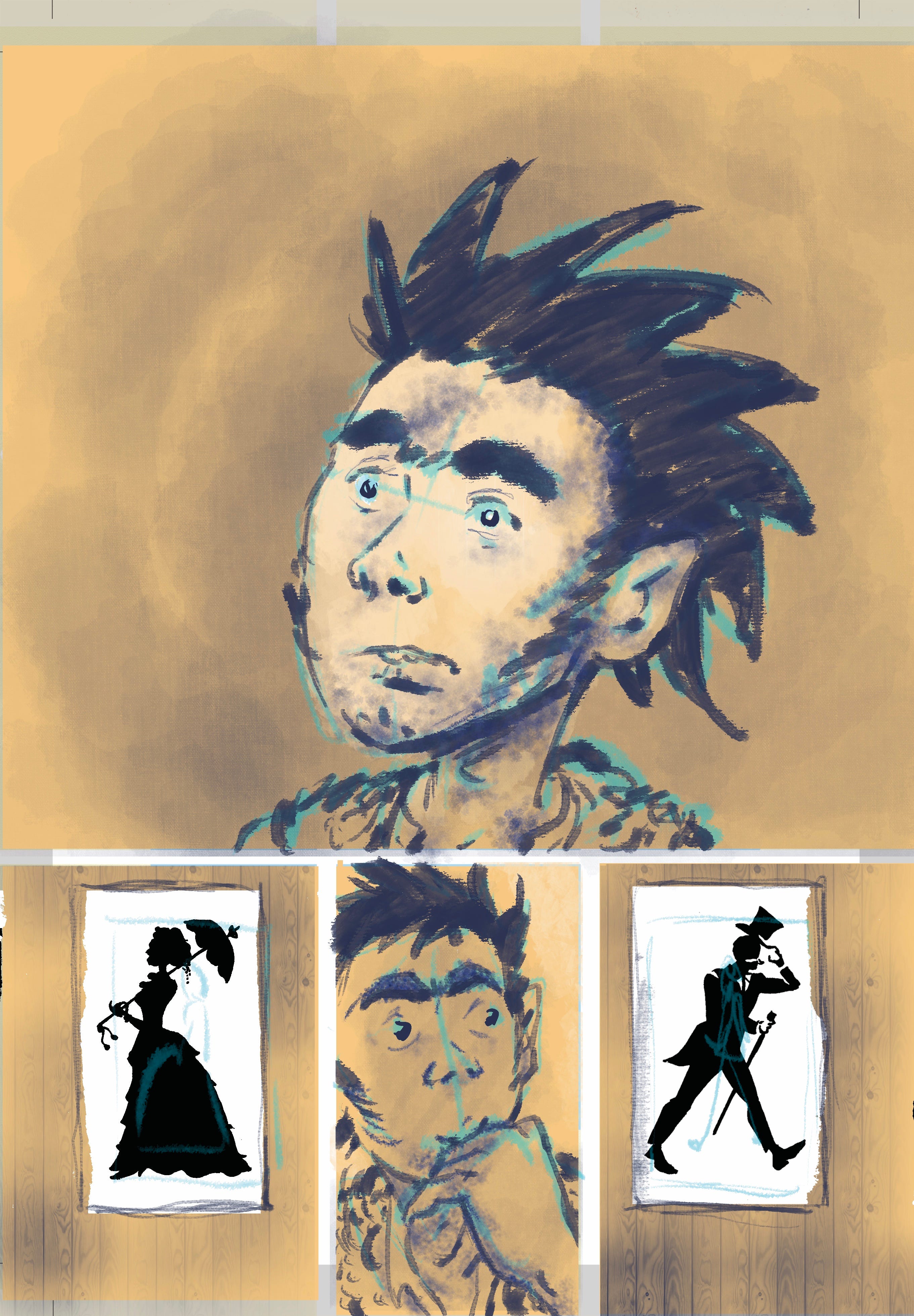
I’ve left the structural blue-line (the underdrawing, where size and shape are settled as according to where any lettering must ultimately appear) on here - and may to some extent leave parts of it in when I composite the final page as I kind of like the effect.
… Unless enough of you tell me that I’m mad to do so, that it makes it look unfinished.
Closer in on the character and the action + different character = different approach.
The only lettering on this page, most likely. And just that blueline layer beneath it all.
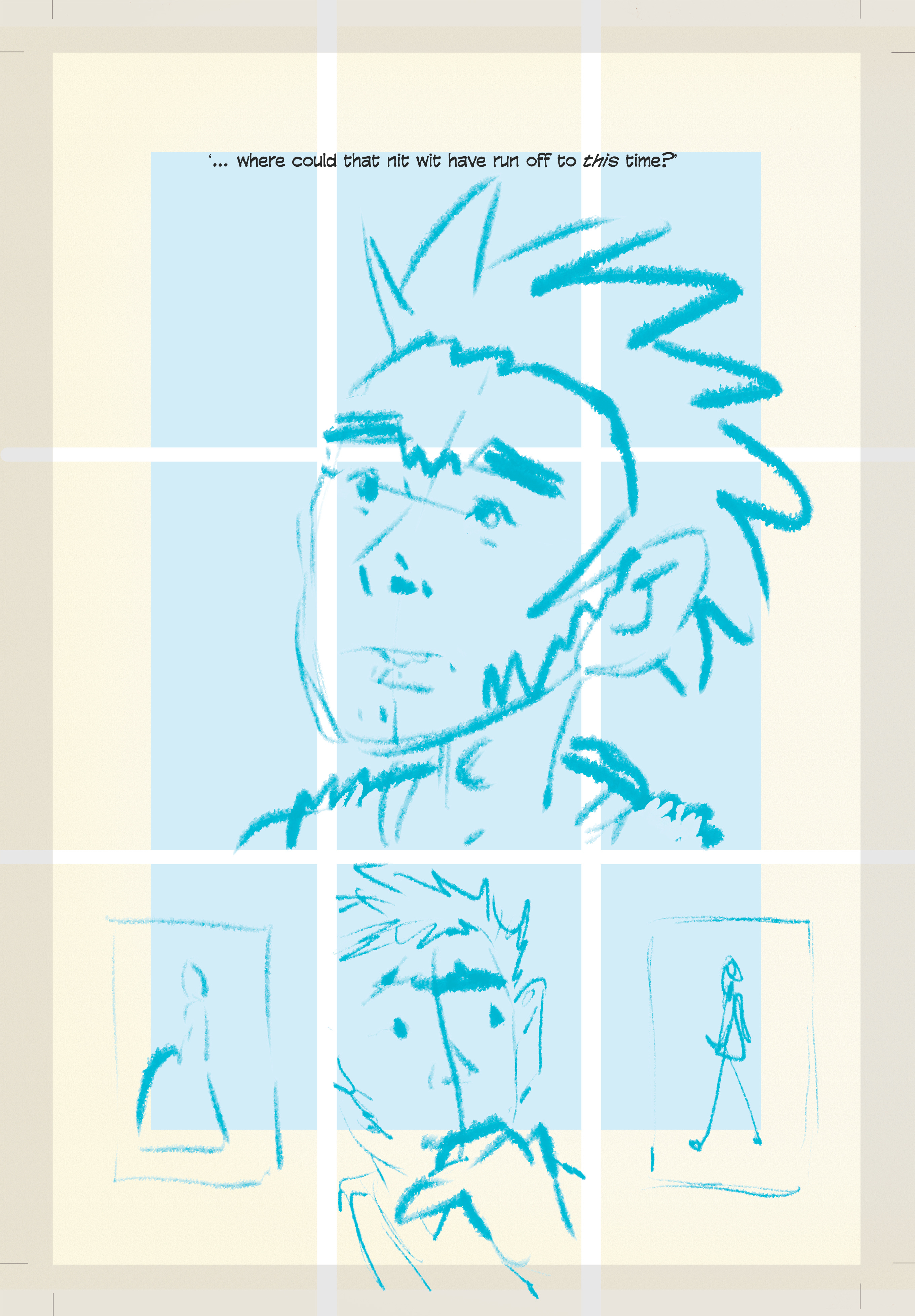
How the final page might look in a printed book, once cropped to size:
Yeah, it’s not finished. If I leave any of that blue in, I’ll be more judicious with the edit.
Nice to see our ROMO though, digi-style and still rough as ferk.
Slow as it goes, I finally begin to feel like I’m making some forward progress. From ‘process’ to ‘progress’ indeed. À la prochaine! X
I believe that nitwit is all one word. Looking great