
ROMO 2, Week 6 - Two Steps Beyond!
Looking Ahead, Stepping Back: A Launch Party, and toward a Brand New Cover.

Hello, the odd case of hiccups continue, and perhaps on a global scale. Try as I might, I struggle to pull focus while my brain chews over successive problems, and mightily so. It does seem though as if everyone is in much the same state - passengers held prisoner on a very rocky boat. So eff all of that off… Let’s ART!
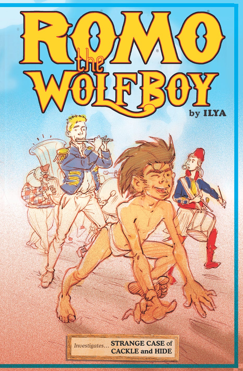
That’s an early ruf draft of a proposed cover concept for a second, international edition of ROMO the WolfBoy, Book One, that’s due come September.
And by ‘international’ I mean (for now), a second English language release in the form of a co-edition between UK publisher SelfMadeHero, along with prospective American partners Abrams. Same size, same page count, same contents, but most likely in paperback as opposed to a hardback, as the current first edition is.
I originally thought I had until the end of this month (January 2026) to percolate on it, and then, all of a sudden, an image for it was required for the Friday just gone (the 16th same). So I girt my loins and bashed this thing together.
Do take the above image with a pinch of salt.
I kind of don’t want you to look, at the same time as not having a lot else to show for my troubles, which is becoming a theme for this year since right out of the blocks.
It’s a first go, a stab at what I want I want it to be, to become. As ever, my drawing is (for my taste, for my comfort, for my stomach) too tight. Too Damn Tight. Unless I really, really concentrate hard to undo that, it just comes out this way - a bug that my efforts trying to break into the so-called comics industry late on in the last century, at the butt end of a millennium, put into my system. I call it naturalism (as opposed to ‘realism’), but either way it has stuff-all to do with the true art of Cartooning. And it is Most Unwelcome.
More on that in much more than a bit, if any folks express interest. But first…
Some inspirational images on the way to imagining a cover redesign for Book One:
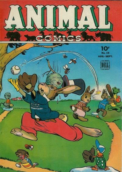
Animal Comics #16, published September 1945 by Dell, USA.
I’d already decided on the fairground-style lettering of my logo before I stumbled across the above, and in situ for what I had planned, the banner headline would not work, lovely and circus-parade appropriate as it is. So I’m just going for the blue sky.
Did somebody say ‘parade’?
Yep, that’s what I wanted…
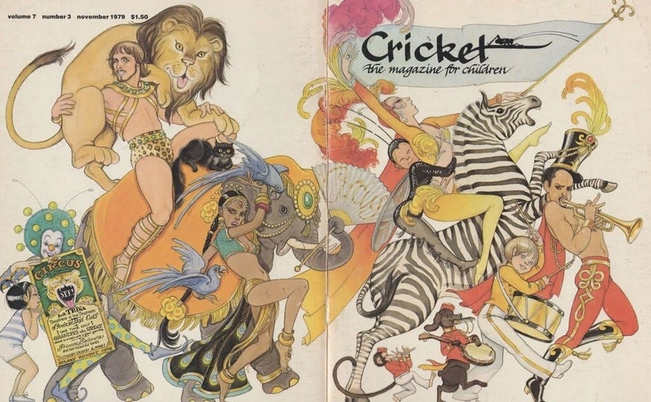
CRICKET magazine, wraparound cover by Hilary Knight, from November 1979.
A circus parade, running across the entire cover spread from the back onto the front.
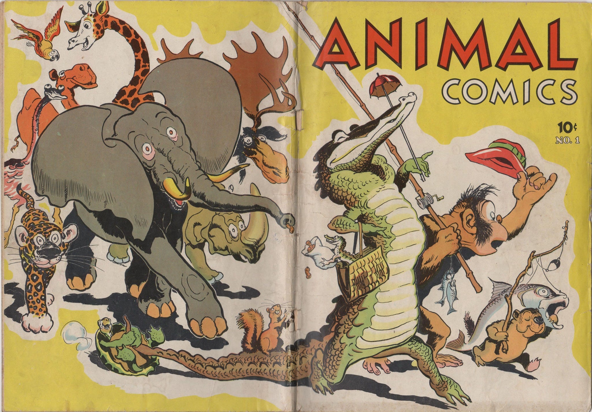
Animal Comics again, debut issue #1 this time, published almost a century ago back in 1942 by Dell, USA. Available now on EBay, an original copy could be yours, if you have almost $8000 handy and going spare - expensive and so much sought after because it contains within its pages the very first appearance of Walt Kelly’s POGO.
Yes, a veritable Carnival of the Animals, with ROMO the WolfBoy front and centre as the biggest humanimal of them all.
See, much as I sweated over and like the first edition cover of ROMO Book One, my instincts tell me that it is a tall order and a harder ask for the simpler tastes of the mass market (and the mass market is very much where I want for ROMO, as idiosyncratic a proposal as it is, to be). I have a great many more adventures for this character and his supporting-cast-to-come planned. And to be allowed to get to those, this little book venture of mine has to sell, and sell well enough so that the returns can support me as I make more - more pages, more books, more more.
I don’t like what I see the dominators of the mass market favouring, and making artists and creators toe the line to do, but that does still tend to have a defining effect - if not on the actual tastes of the general public, nebulous as those may be, then on the eyes and ears of the book reps, the ones who pretty much represent one’s wares to and on behalf of the larger marketplace (to the distributors and bookstores, before any customer response comes into it). And they like what they know, even where they don’t much know what they like. Out there in the real world I’ll be at their mercy. Without them onside, my hopes and chances are pretty much sunk. It has a certain whiff about it, but that’s the way it is.
So given this second shot, and having already done it MY WAY, I’m going to try and aim for something crowd-pleasing: more colour: brighter colours: the suggestion of action: and making fuller use of the opening volume’s cast of circus characters. Since my aim is to appeal to the broader American market as well this time - on top of all the above, why not sneak in a sneaky reference?
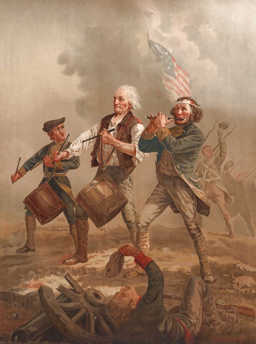
An homage to Independence, in the form of the Spirit of ‘76! (1776, that is) - an original painting by Archibald M. Willard, Ohio artist and Civil War veteran, created for the 1876 U.S. Centennial Exposition in Philadelphia, and initially titled Yankee Doodle. Dandy!
But I need it to suggest even more of a parade than it already does, so I flip it. (L>R)
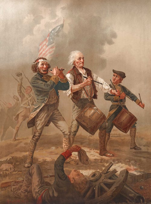
My thinking is, even if the effect is subliminal, merely the suggestive echo of what was and remains a popular print and a hugely iconic image, it might yet have appeal. A peal as long and as loud (and just as cracked) as that of the Liberty Bell!
So, once again, in this moment in time at least, this is what I’ve arrived at (for now):

The planned parade of circus troupe figures will continue on behind, and run around across the book’s wide spine (it is 256 pages big, after all), even onto the back cover.
But it doesn’t look how I want it to yet: this serves as just my first suggestion - To Be REFINED. <DEFINED. REDEFINED. REFINED>, an old mantra from my college days - was it from John Berger’s Ways of Seeing, or did I perhaps make it up myself?
I want it to look - and ROMO most especially - Immediate. Immaculate. ICONIC.
Help me get there, why don’t you. Tell me what you yourself make of it, pro and con. Your chance to let me know what you honestly think and to help influence where I might take it to next, to help make it work better…
More to say, maybe, but enough here to read and look at for one week, at least.
To end with, since we’re talking of Book Covers, and Influence, check THIS:
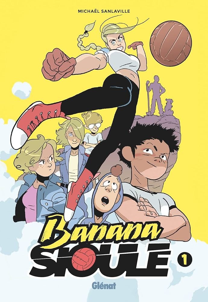
Just a few days ago now I devoured (and HUGELY enjoyed) the first of 3 volumes of this French manga series, Banana Sioule. It’s about a young female candidate and her friends for the action-packed and brutal dodgeball-style game of the title. An unabashed “love letter” to shonen (‘boys’) action sports-manga from the co-creator of LASTMAN, MICHAËL SANLAVILLE, with a real atmospheric sense of friendship, family and place (think the rural drama / character comedy of filmmaker Bruno Dumont). And the on-page choreography really is superb.
Vols. 1 and 2 just debuted in an English language adaptation. Get on board and Score it NOW! Top Recommend!!
Plus, see that cover? Now THAT’s an iconic cover. That’s more like what I want.
But not the faux-1970s movie poster melange of characters, good and effective as that is. Me, I’m sticking with my Parade concept. Don’t go raining on it now. (Uh, not unless you genuinely hate it, that is. ) Just, y’know, making it more ICONIC > yah! X
Next Time: It’s Official - the ROMO the WolfBoy retail launch party comes to town!
__
I like it a lot. I like the cover to the HC too but this is more eye-catching.
Agree with Rob. The hardcover is very sophisticated looking, this screams fun! Although, I've always liked the scampering figure of Romo you considered for the initial front cover. That could work here.