
ROMO 2, Week 19
X-RAY vision: Building a page, layer by layer

Hello. Let’s get back to some PROCESS.
I taught a few workshops last week, and one aspect that kept coming up was a fundamental narrative technique: answering the questions any reader or indeed viewer would have when you are wanting them to follow your story.
In no particular order these are:
WHO?
WHAT?
WHERE?
WHEN?
HOW?
WHY?
and at the outside
WHICH?
ROMO Book Two is a Work in Progress, a WiP (and one I beat myself with on a weekly if not a daily basis). The opening scene I am crafting is a lengthy and complex one, involving more than one surprise reveal. So, at the outset, I’m deliberately withholding some of that crucial narrative information from the reader. Bait the hook to catch the fish… is my thinking.
Page One is designed to excite and make you go ‘What?!’ (or even ‘Coo!’)
Page Two begins the ‘Who’ of it, expectations then undercut by Page Three.
Page Four resumes the Who with a large and handsome close-up shot of our titular star.
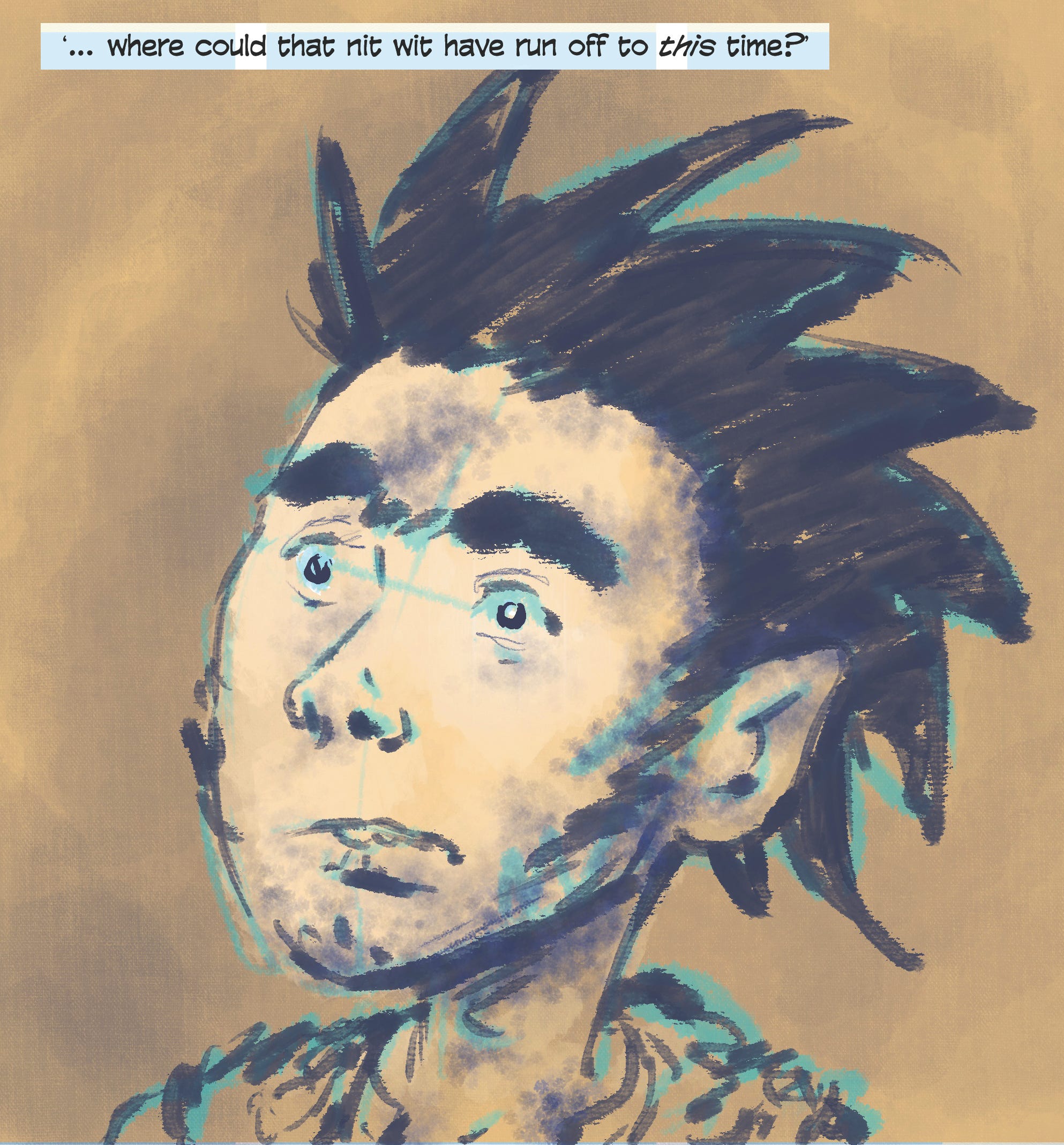
Pages Five and Six gives us a wee dose of What and more Who, alongside some misdirection… leading up to the first of our reveals on Page Seven, which is a Where…
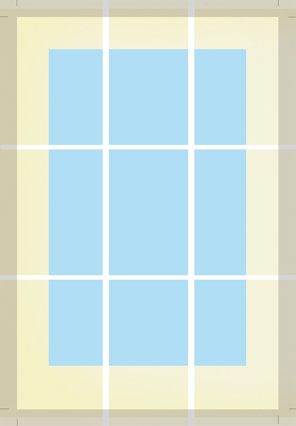
In layers, then. At the base level of each page is my strict-and-yet-versatile Page Template for this book. It’s on a 9-panel grid: (up to) 3 tiers, each made of (up to) 3 panels, with crops and the greyed in area showing the ‘bleed’, the area of any full page that gets cut away or else disappears into a central margin of the final, bound book.
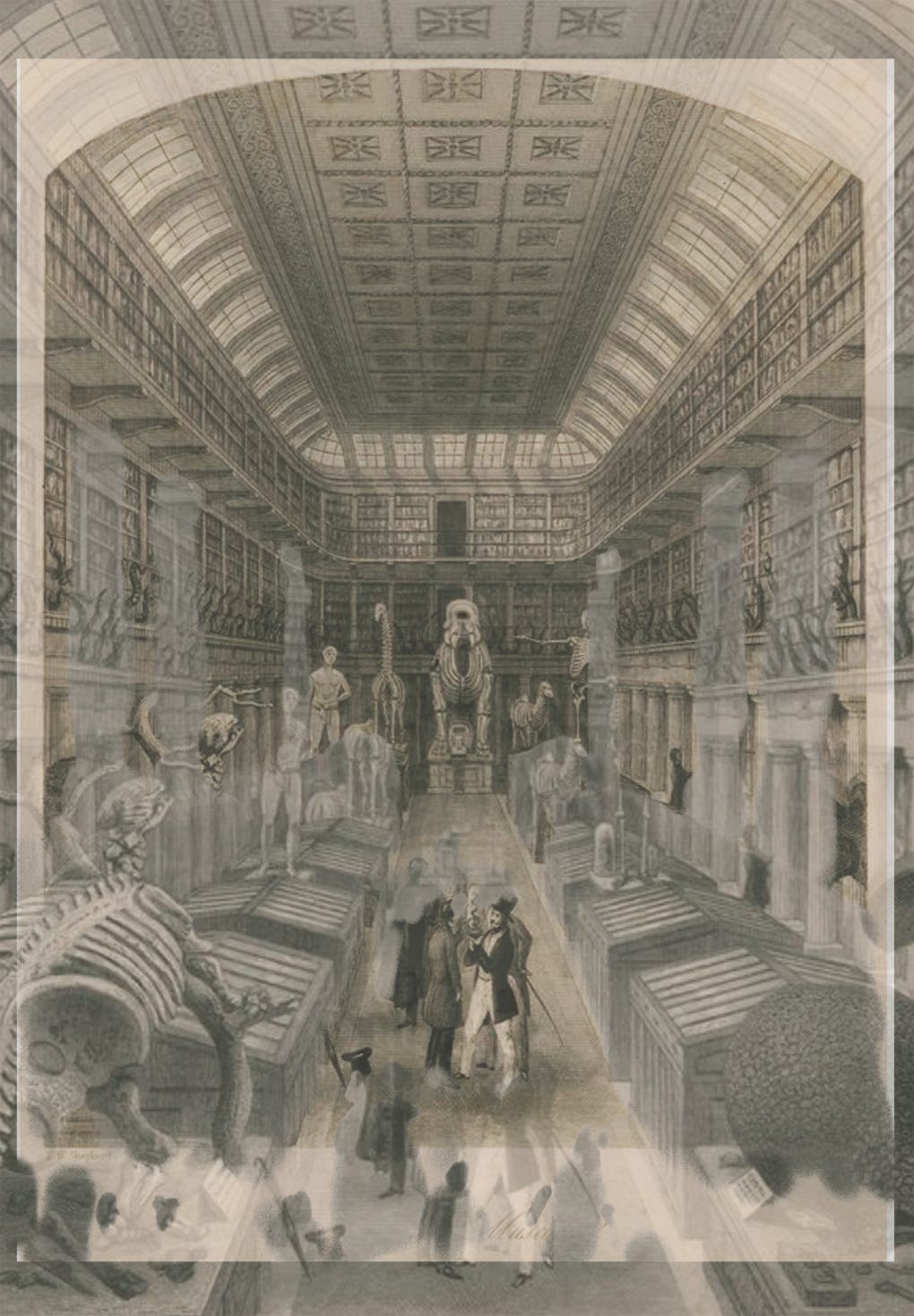
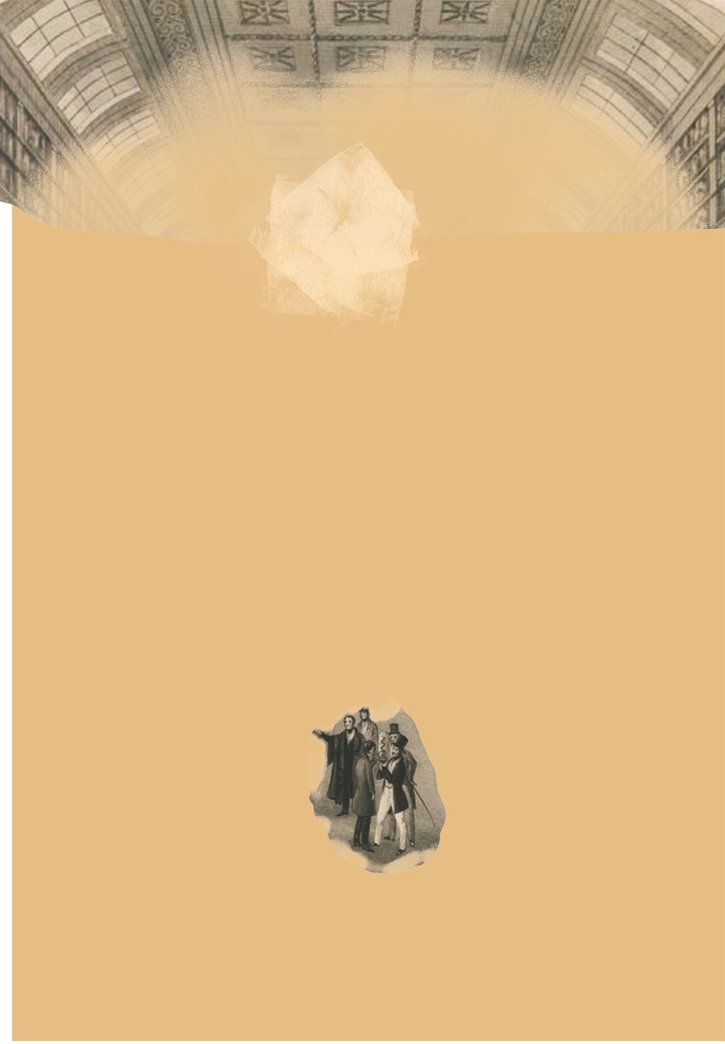
I have a distinct setting in mind for the action taking place on the pages preceding and following this one, and here it is, definitively revealed:
Except that’s a contemporary illustration of some different place, not the actual location I’m making plans for. But it has the right angle and feel for what I want to evoke. I’m not going to say here where either of these places were (and in one case, still are) as that’s going to be part of the story that I’m telling: that’s for the book. But yes, the above image is the starting point from which I build my page.
You saw the area that will get cut off, as according to the Template, so I need to resize my reference image to fit, so that it will show to the full extent what I want to be seen.
This necessitates some jiggery-pokery (official trade term), cloning the array of high windows to adequately fill the top area of the page, and resizing and moving the few figures that were visible, in case I might make use of any of them in my final image.
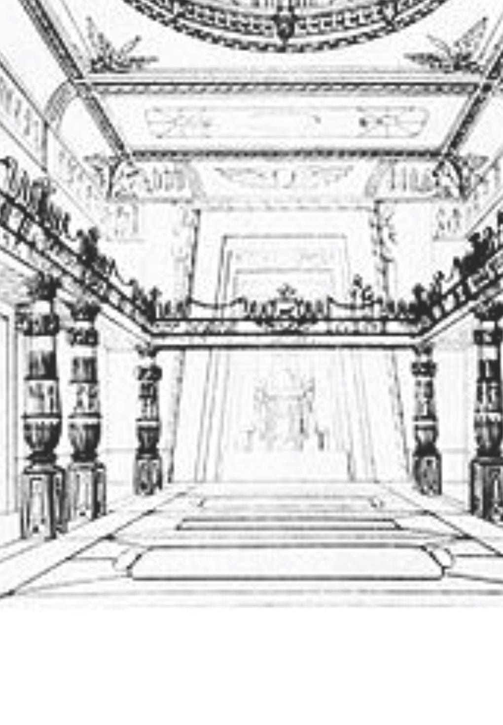
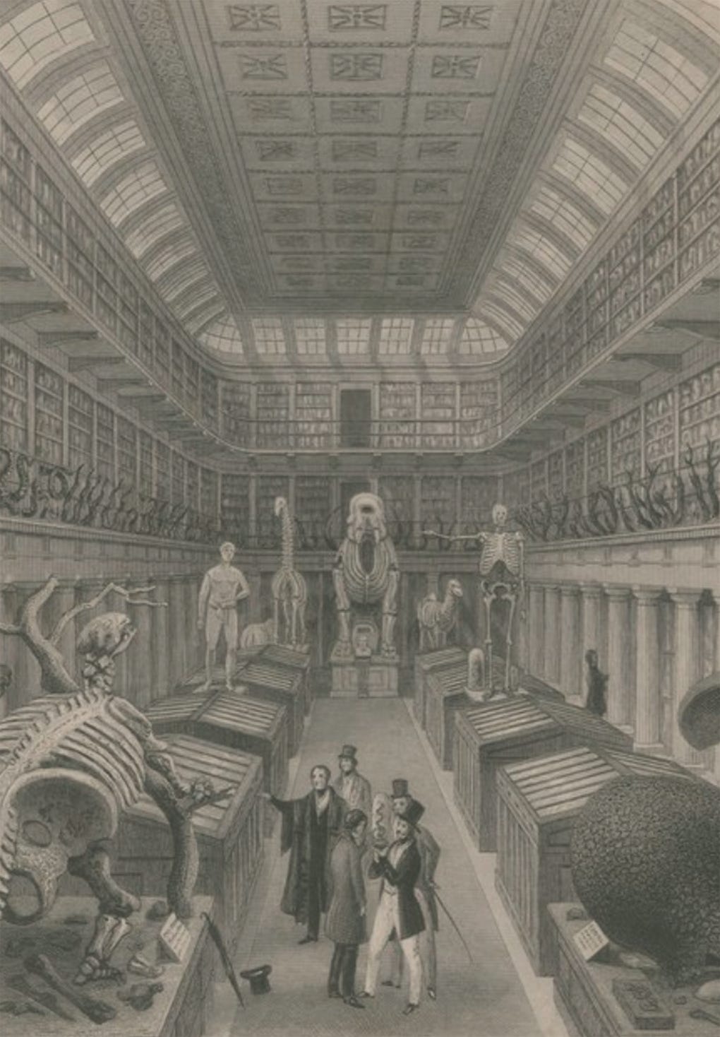
Now (excuse the image quality), THIS interior is the real location my scene is intended to be based on. And again, for now, I’m not telling you exactly where, but there are a few fuzzy hints visible in there as to the nature or implied character of it. Somehow I’ve got to smoosh the divergent styles of the two different locations together.
I take my newly distorted image and working with a base colour (the same one that’s present throughout this entire opening sequence, bar some flashbacks), lay in lighting effects with some tone brushes - illumination from the high windows and a little reflected light from the ceiling, with deeper shadows as we process down from there. It looks more faint or washed out here than the actual values used, but that’s down to the display in a Photoshop file version of the layered original, taken from my iPad.
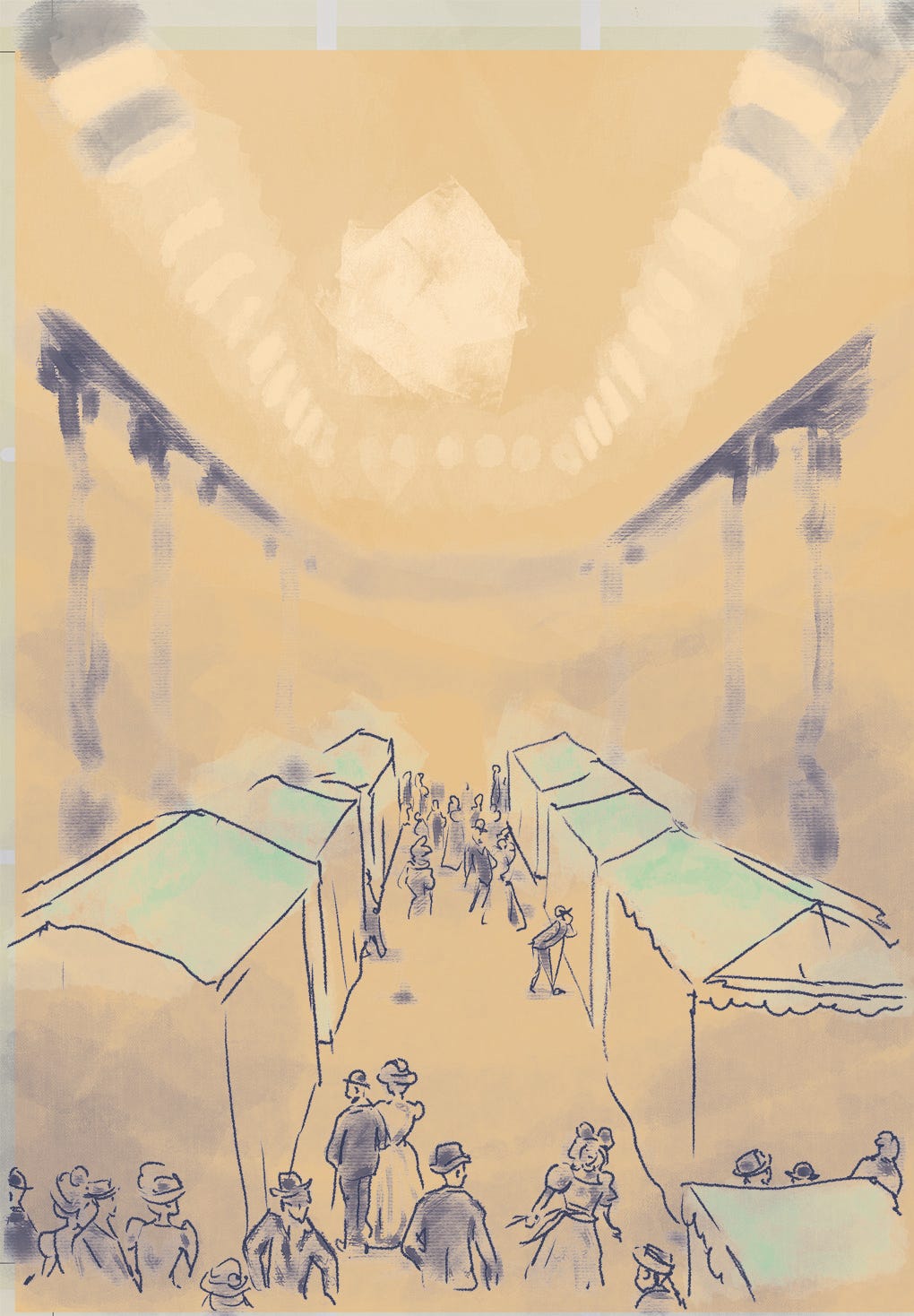
I draw in sideshow tents to replace the glass cases from before, and add in a milling crowd of sensation-seekers in their late-Victorian garb (helping to answer When).
Then I redraw the extended windows, add in columns beneath the balustrade, and lay in source images from the period depicting real sideshow attractions for that time and place. They need to be heavily distorted and almost obscure in perspective from this angle and elevation. Overall, it’s a very rough piece of drawing. My original intent was to draw it all completely: but the longer it went on (and this is already the work of many hours and much planning and pondering between), the more I became tempted to leave in much of the detail from my reference sources for this large interior shot.
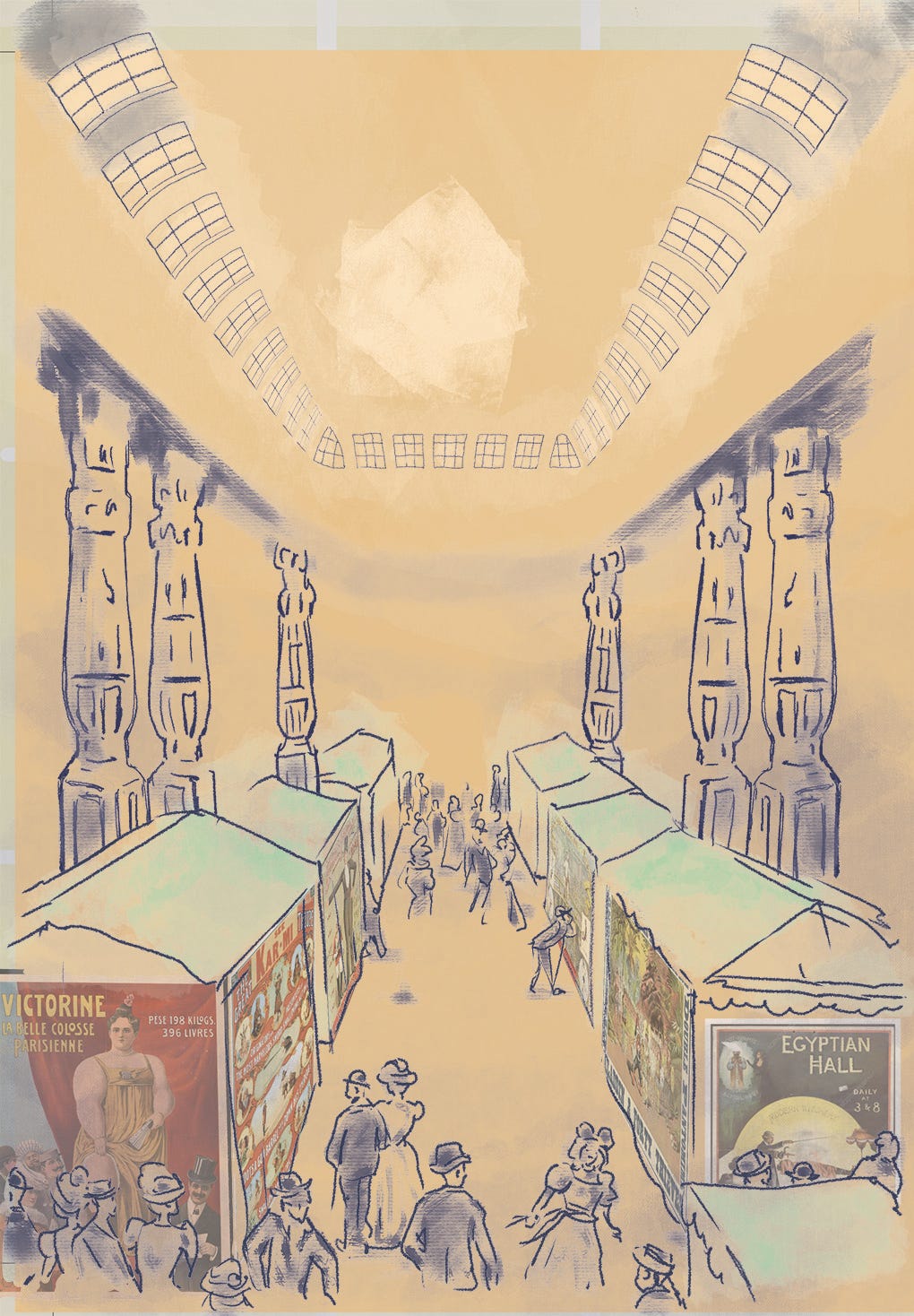
Giving us, THIS:
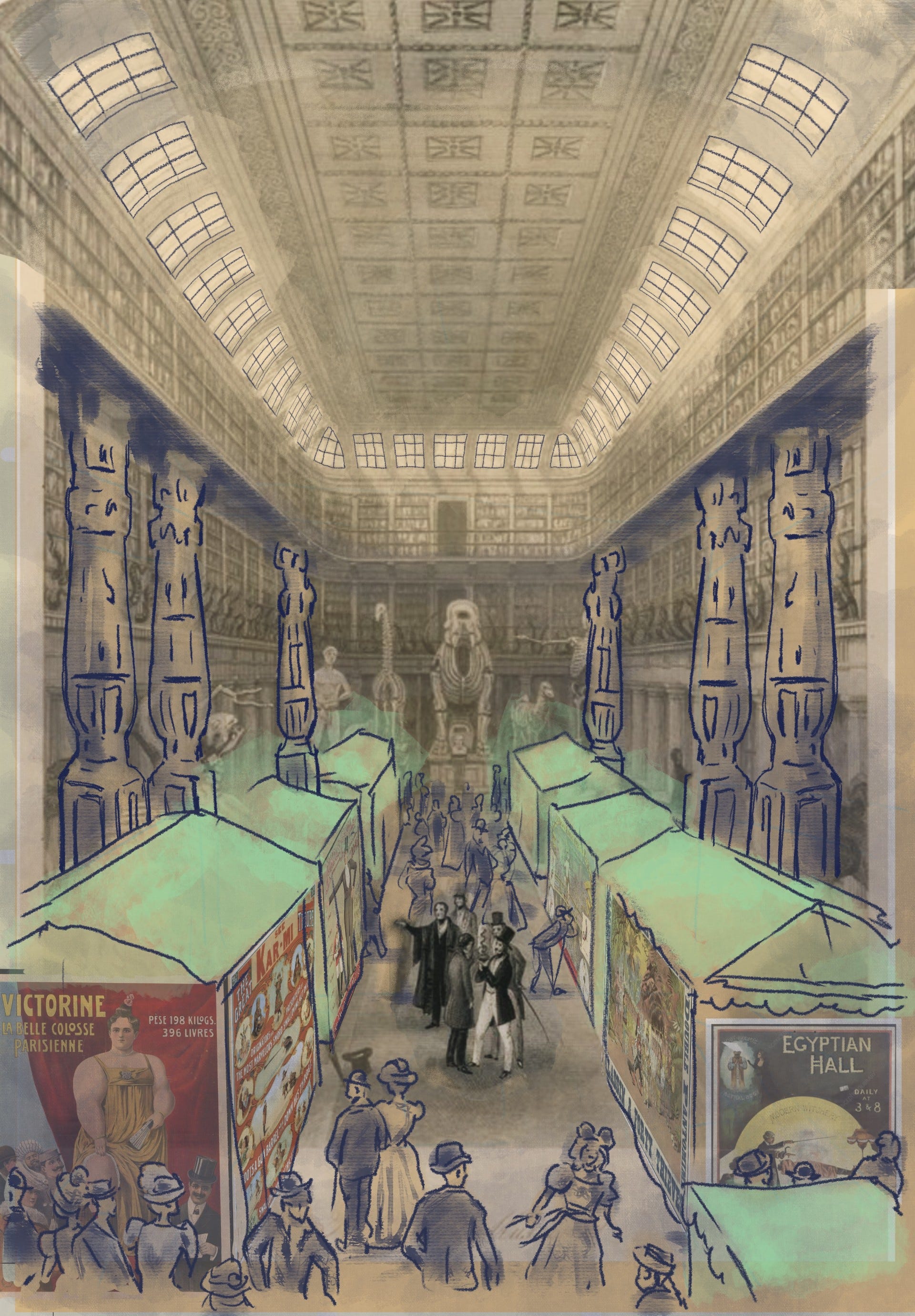
Make of it what you will, but this is where I have got to with it thus far. Some speech balloons need to be added on, and after that I mean to take a final run to tidy it up and unify the whole to my greater satisfaction. It’s been a nerve-wracking process. Does it work? Will it suffice? Does it look too slap-dash or lazy?? I tell myself that it does the job and conveys enough while not swamping in detail, so the story keeps on moving.
(That’s MY story and I’m sticking to it!)
What do YOU think?
Some selected quotes taken from reviews of Book One, lately shared online:
With thanks to Jacob at SelfMadeHero for putting these excerpted quotes together.
And finally, THIS coming UK Bank Holiday weekend, I’ll be HERE:
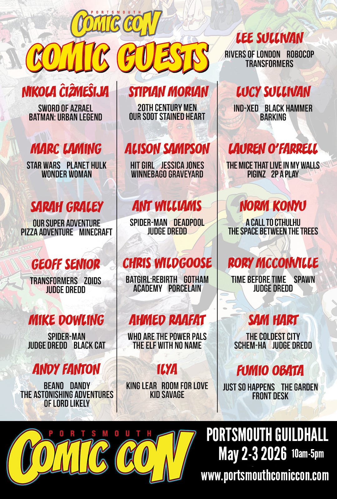
Portsmouth Comic Con - and with Free Comic Book Day on the Saturday, no less.
In a very small cosmos, I am a star.
Gotta star(t) somewhere...
But for now here endeth the new news.
Phew! Glad you think so!! X
That looks really nice. Not slap-dash or lazy at all.