
ROMO 2, Week 17
More shows... and reworking the book's New Edition cover. It's Different!

Hello,
More shows in store. As if an appearance at LICAF in October (as detailed last week) wasn’t enough, I’ll also be taking myself and copies of ROMO here in November:
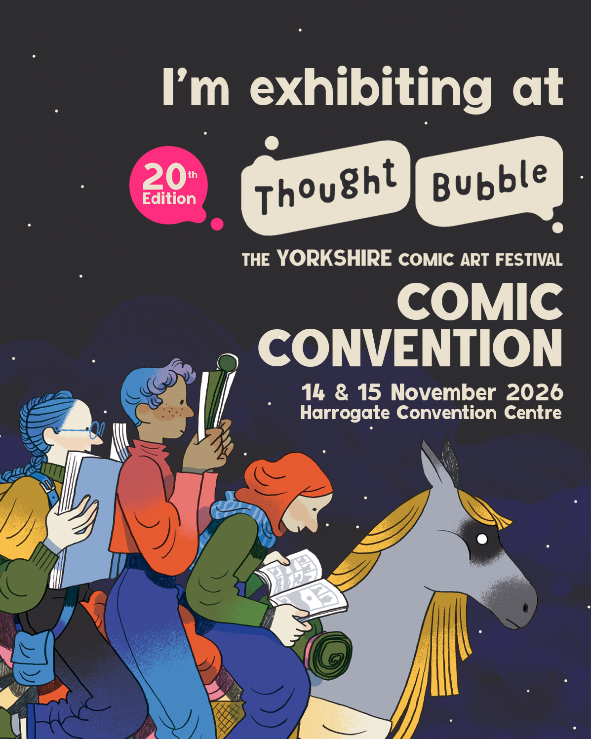
I previously attended a few times while it was on in Leeds, but this will be my first time in Harrogate. Hoping to have better luck there with ROMO than I did with Kid Savage! Erk Alors
By then, and for both of these North of England shows, I should be armed and ready with copies of the second and paperback edition of ROMO the WolfBoy Book One!
And before any of that, the plan is for me to take it to North America, as the second edition will also be available for sale there, from September 1st onwards, thanks to SelfMadeHero’s partnership with US giant, Abrams. But more about all of that, anon.
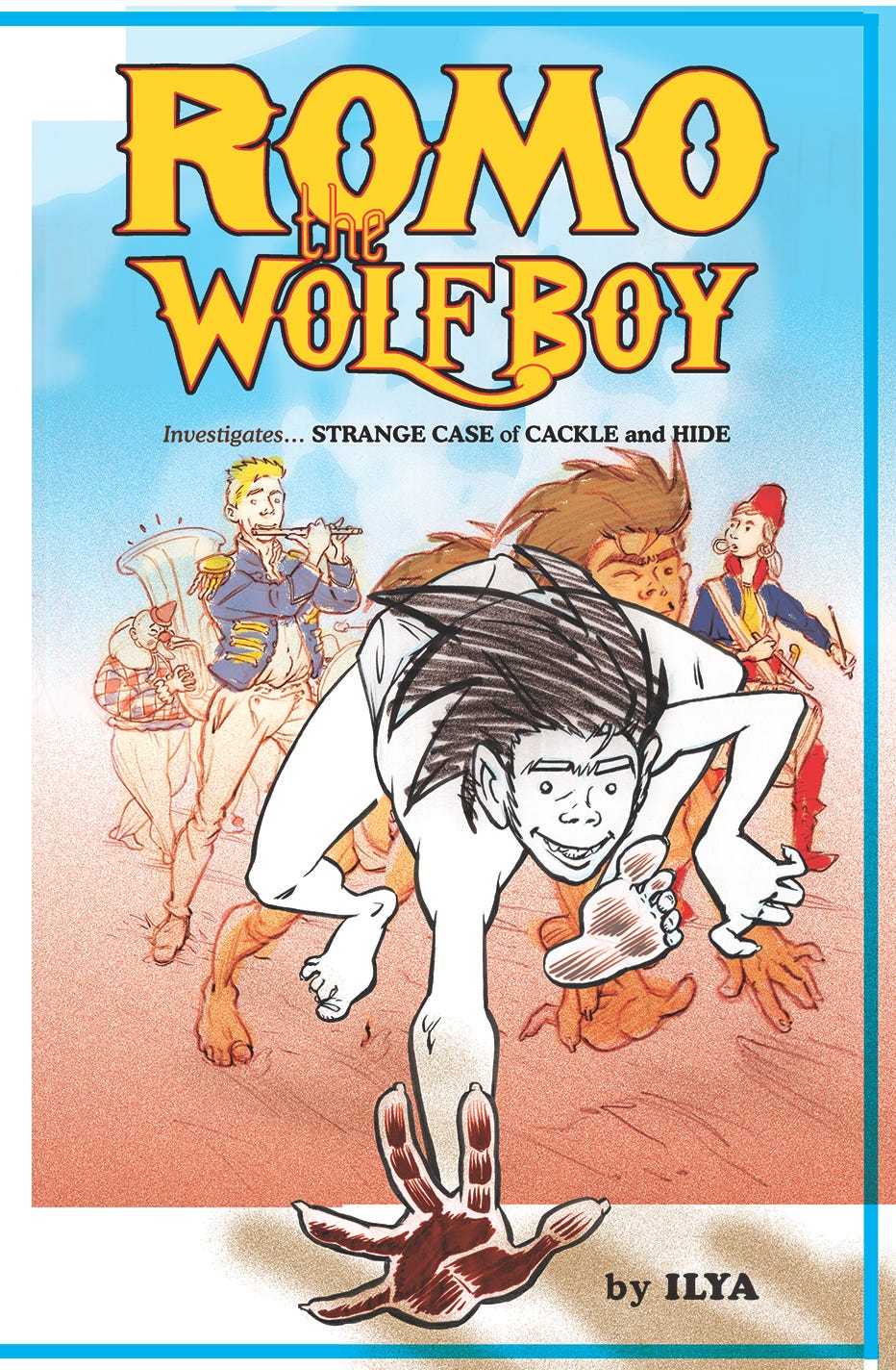
Finally free to return to production on ROMO, but before I can continue crafting pages for the new Book Two, top priority is to sort a NEW COVER DESIGN for the aforementioned second, paperback edition of Book One.
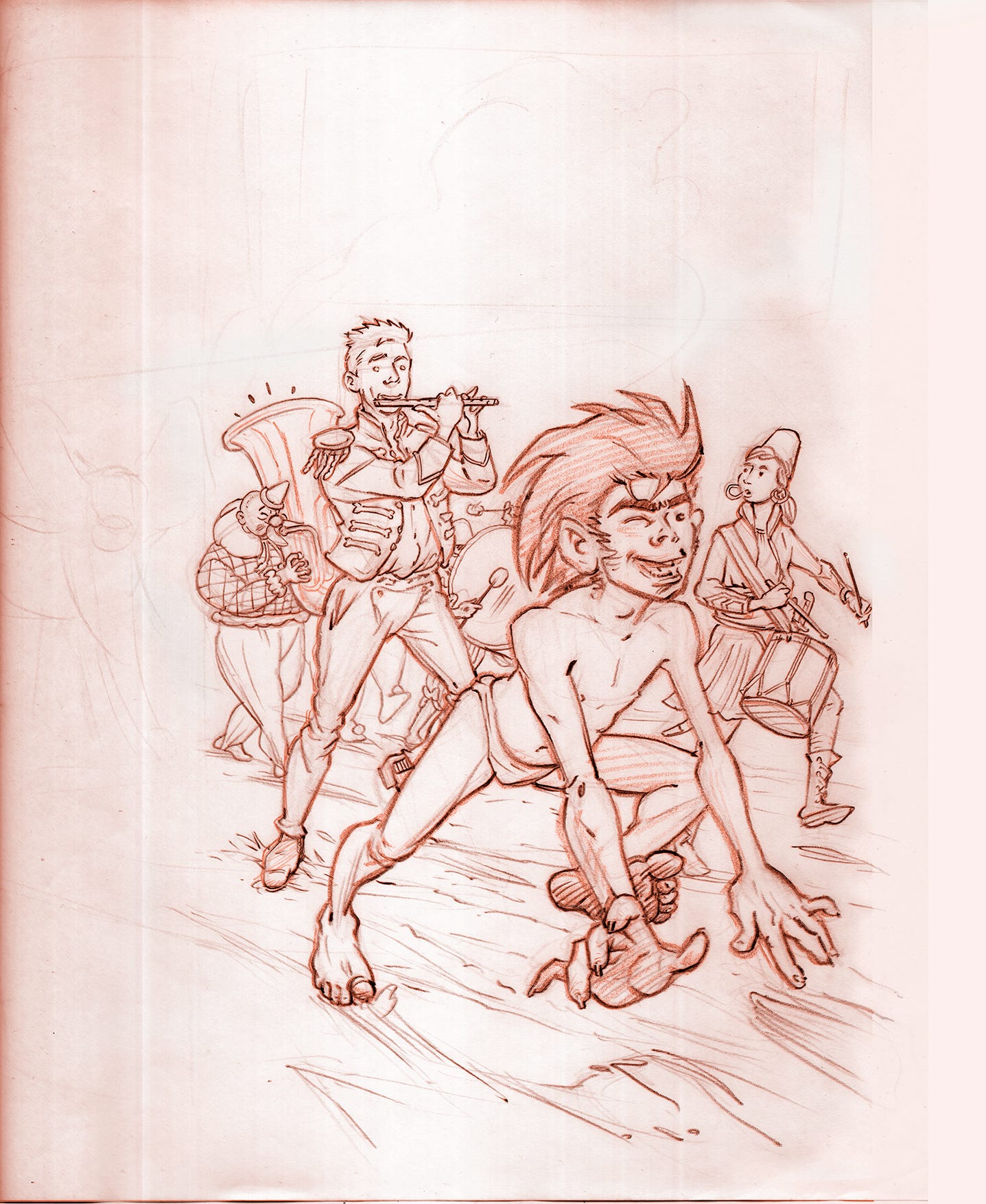
This was roughly my concept for that new cover, as I have shared with you here before.
And under the gun of a very close deadline I had to rush-release this rough draft sketch, so that it could be shown to the marketing departments (book reps) of the various companies that would be involved, and hopefully meet with their approval.
The thinking was to aim at something brighter and perhaps more inviting to a potentially now international audience, in full awareness that the current marketplace for books that are also suitable for children and younger readers tends to skew young in the way that it presents. So as far as that goes, Job Done. (Do bear in mind the fast colour job above is very much for the sake of a Rough Draft proposal only… NOT FINAL COVER, as we like to say in the trade.)
I myself was not happy with it, however. The new drawing, my first returning to the former circus troupe theme after quite some time, felt a bit too stiff.
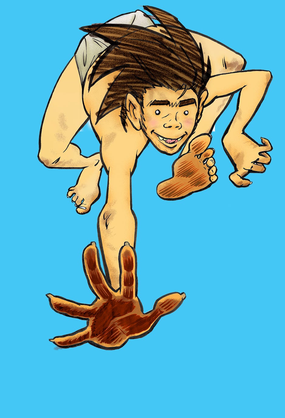
The foreground figure of ROMO, in particular, wasn’t working for me. His elastic energy is a hard spirit to bottle.
So, I went back to the drawing board…
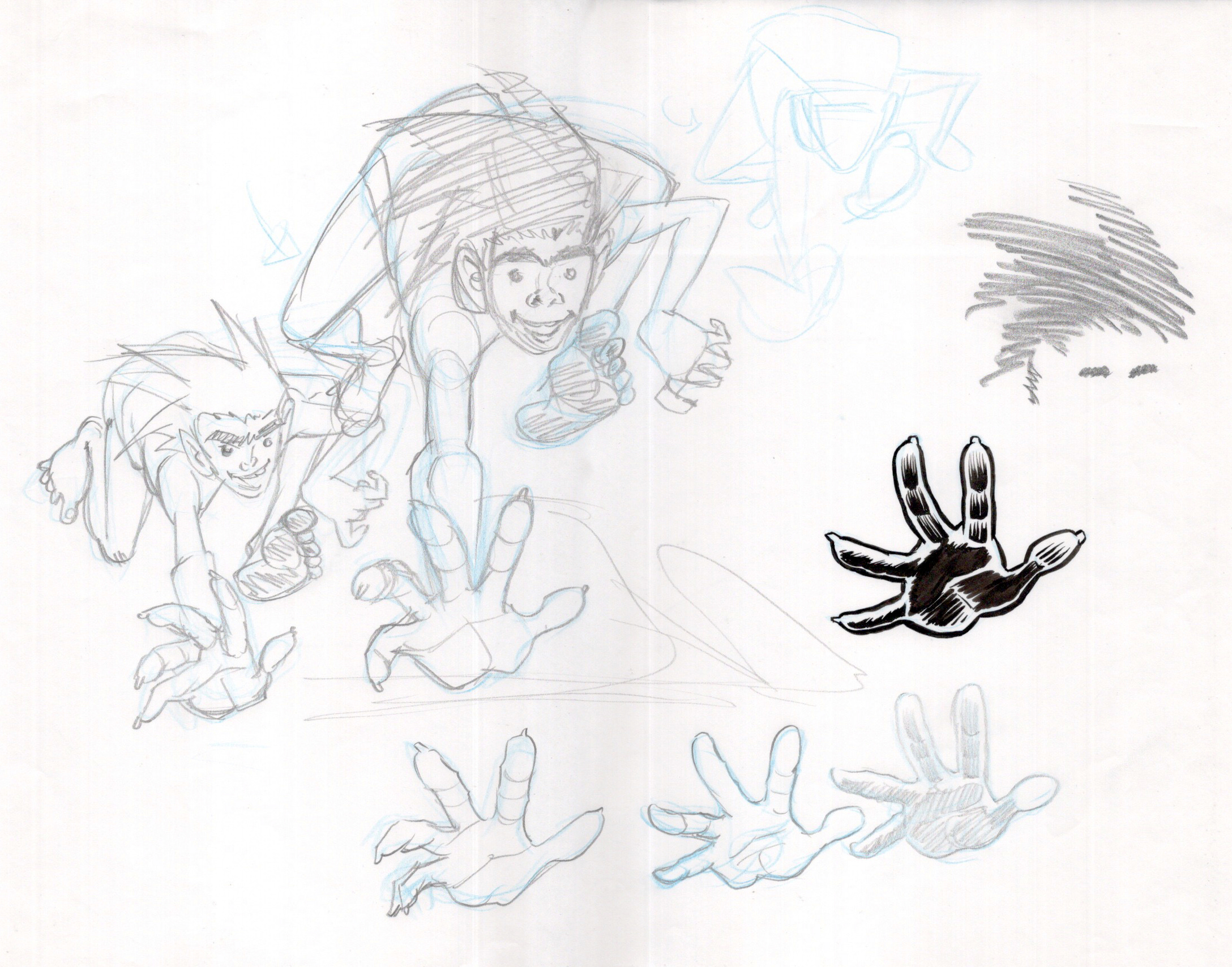
Hands are hard. I always wrestle with their articulation a bit before I can get them to work.
Hoping to keep my trio of central figures, in homage to the independent ‘Spirit of ‘76’ (see my previous posts for details), I first experimented with slapping down the new ROMO figure and seeing how it might be made to come together.
The following happened purely by chance.
I tend to scan first drawings - whether done in layers of pencil, as with most of ROMO Book One, or, as here, crafted in ink - at a higher resolution (600dpi) to catch all of the fine detail. Once in production I take the scanned images down to 400dpi, more suitable to four-colour (CMYK) print reproduction, before working on them further. This also helps to keep file sizes down.
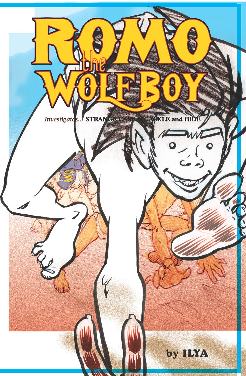
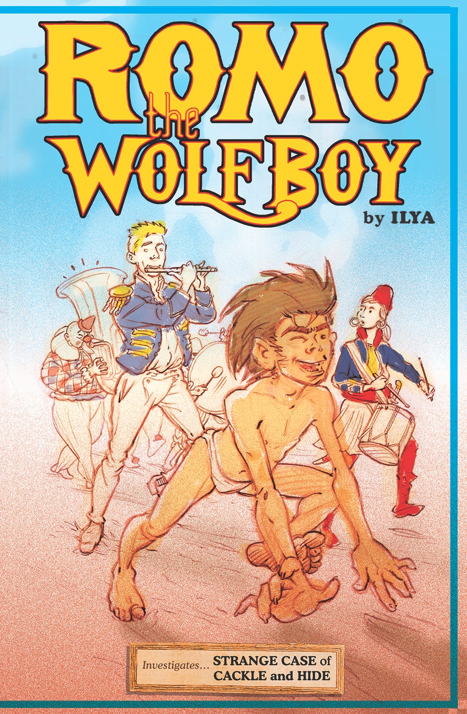
SO, when I had first imported my new ROMO drawing, it appeared outsized in the former layout, just so. I found myself immediately very taken with this unplanned result and kept on returning to it - finally deciding to make this the basis for my radically new cover design.
With a little further jiggery-pokery I managed to revise and keep my other figures just visible in the background. It seemed important to keep at least a hint of a suggestion of the parade of other colourful figures, and also the circus theme. But no doubt here that ROMO is The Star!
The blue frame had been a hangover from the prior incarnation, and while I liked the way that it also held the exploding figure of ROMO slightly in check, it was removed at the publisher’s request, so as to ‘avoid any possible confusion’. No more blue frame.
Of course, you can barely see those figures behind. So wherefore the ‘Spirit of ‘76’?
That now becomes the central design element of the proposed Back Cover, continuing on the parade from the new Front. The following still a WiP, a Work in Progress…
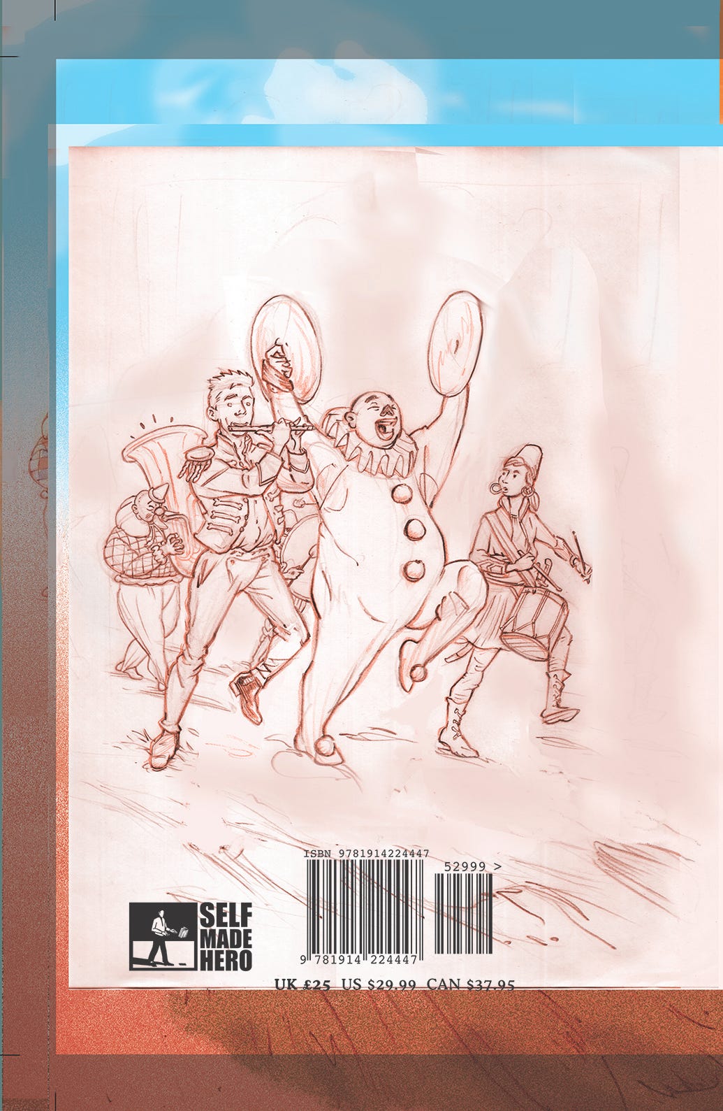
The Whiteface clown, on cymbals, takes over the central spot where ROMO had once been.
Lots of room remaining for additional back cover blurb and text, as is traditional. Got to write all of that up, next.
The opening spreads of the book (the IFC or Inside Front Cover, and IBC or Inside Back Cover) - which were boldly striped in the first edition, to mimic the colours of the Blimey O’Reilly circus tent - are now planned to feature the continuation of the parade that was originally conceived as the back cover (for the older cover sketch concept), at least on the IFC… is your head spinning yet? Mine is.
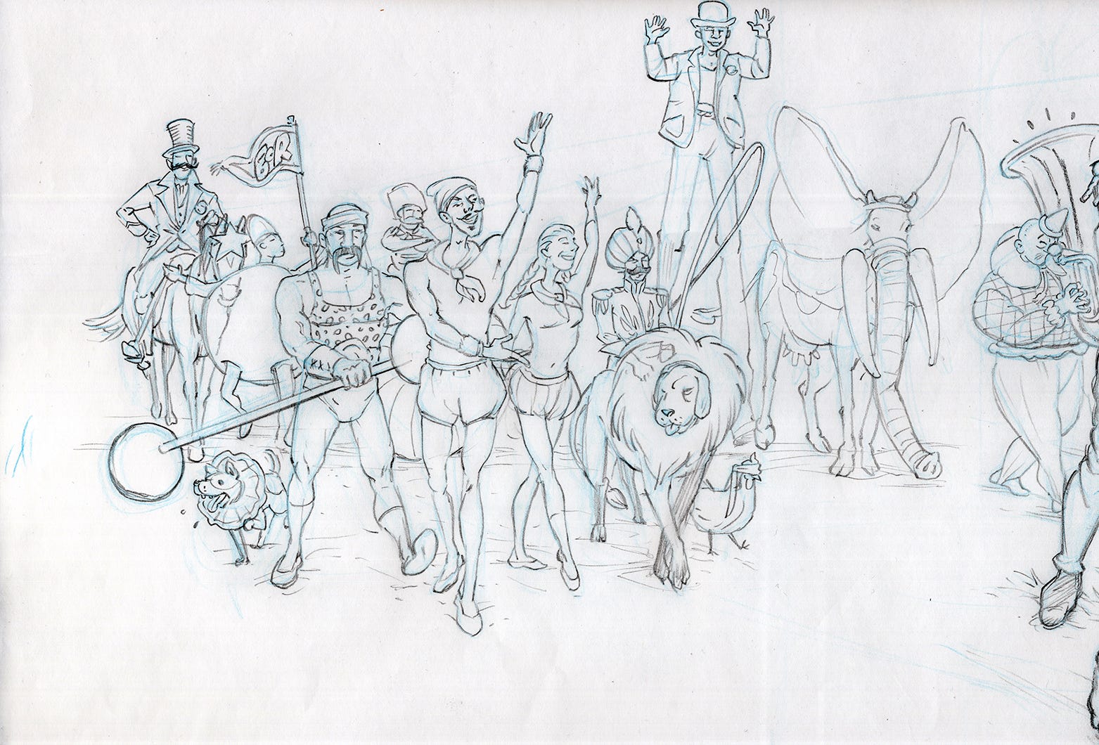
Pencil drawing for the IFC spread (scanned prior to the secondary pencils being added)
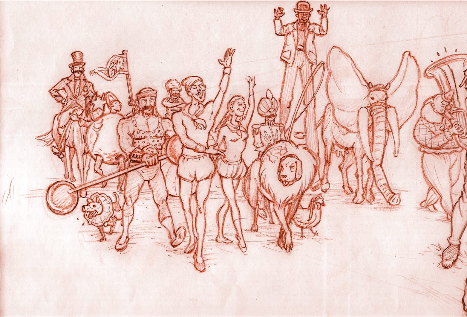
Colourised version of same, including the second draft extra layer of pencils. This is achieved using two different shades of brown and on separate and distinct layers (a technique as displayed here in previous episodes), done by toggling up and down the hue/saturation menu in (accursed!) Photoshop, which helps the drawing come further alive once these two varicoloured layers are smooshed together. Innit.
Rough draft as yet - additional colour will be applied both here and on the back cover.
As for the IBC or Inside Back Cover spread… there, the overall concept and implicit continuation will, um, continue! I’m also currently working on that, but as to what it looks like: for the present moment that’s for me to know, and you to look further forward to! ENOUGH!!
Onwards and upwards, or sideways… That’s it for this weeks Adventures In Publishing. More next week. New Pages. More Shows. More of everything, really. MORE!
Bless ya, Peter - and hugely glad to hear that you think so. I've been living with it for a while now and thankfully I'm still into it, so that's promising. No one likes the wrong tattoo!
aw, thanks - I try my best! Be sure to say hello and identify yourself, come Harrogate time. We'll be there before we know it!