
ROMO 2, part 25
A return to basics: panel grids and page structure

Hello.
This time around, I’m returning with a behind-the-scenes PROCESS talk on Page Layout - specifically the use of Panel Grids to divide up each page into separate but collective narrative units - the sequential aspect at the heart of Good Comics.
This here’s a subject that first I brought up in just the second of these current ROMO 2 episodes, way back when: NOVEMBER 27, 2025 to be exact (You can easily find and review this in the ARCHIVE feature, if viewing within the Substack app: simply hit the greyed out button that says ‘See all >’ and dial down from there until you hit the one entitled “The Fall and inevitable Rise…”)
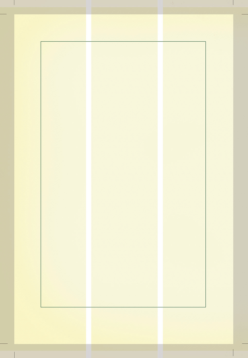
Here’s my basic page unit.
There are elements visible here that won’t be seen on any final page - the entire border area that’s greyed out is chopped away, as it goes beyond the crop marks seen here at each corner (and those will go too). This is because my panel drawings can and often do cover the entire visible area of any page, and so I will draw them to the visible or cropped edge and beyond: What’s called going To Bleed (the grey area that’s then lost being called The Bleed).
Then there’s a more central box marked inside the layour above with a green line. That’s the Safe Area. I should aim to keep all of my lettering and special FX within these bounds or else they risk being cropped away, or disappearing into the central margin of the printed and bound book - the more pages, the more risk there is of this.
You can see that I have divided my page into 3 equal parts within the so-called ‘Live Art area’ that remains within the boundaries of those crop marks. My Page.
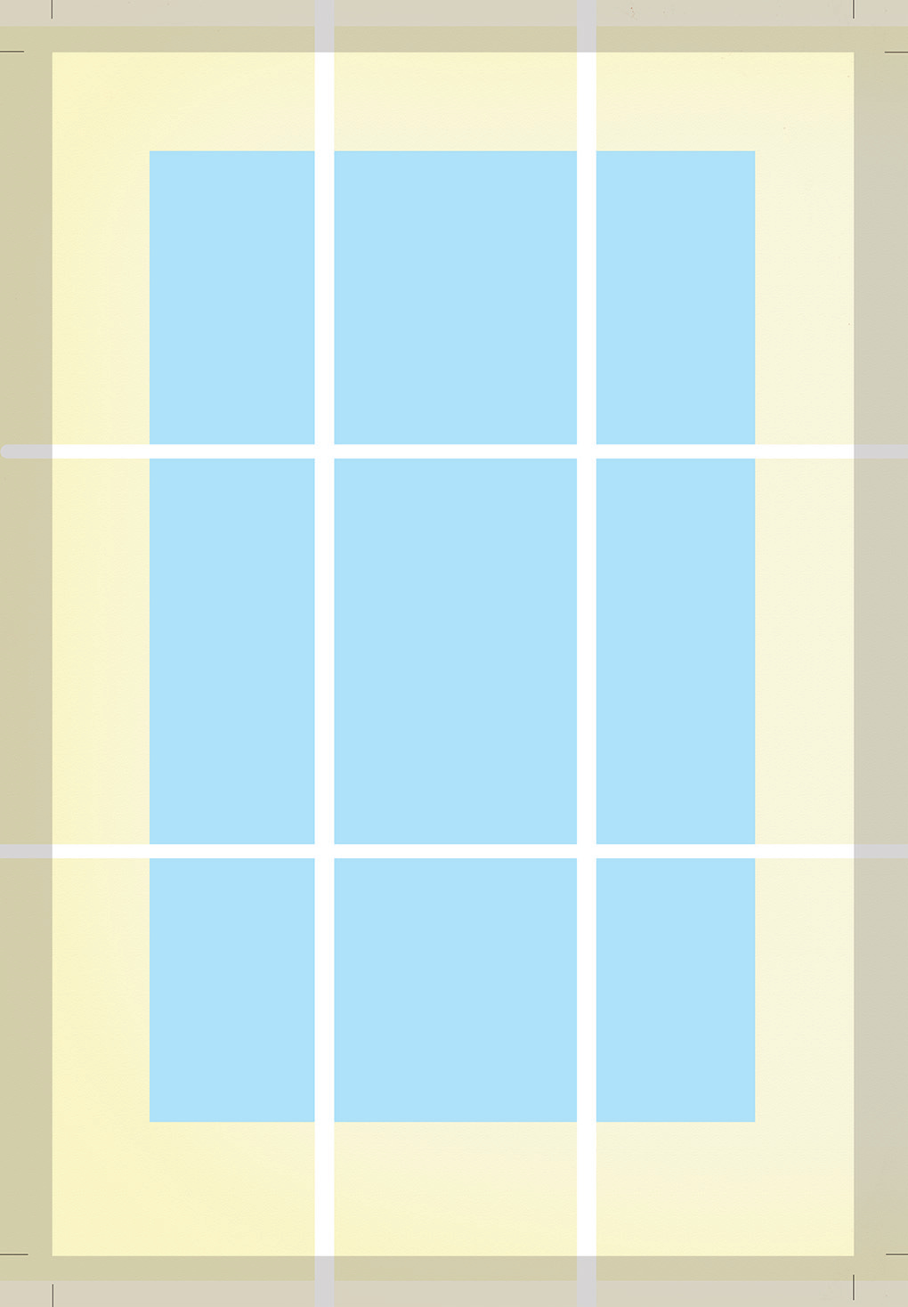
Here’s a fully laid out grid for my standard page unit, the Safe Area for lettering and important detail now coded in blue. In addition to the vertical division into equal thirds, I’ve done the same horizontally, to produce what is known as a 9-panel Grid, running across 3 tiers or levels. The famous graphic novel Watchmen is probably the most well-known example of a comic strip designed on the basis of a 9-panel Grid.
Now, this doesn’t mean that every page in my new book will have 9 equal panels.
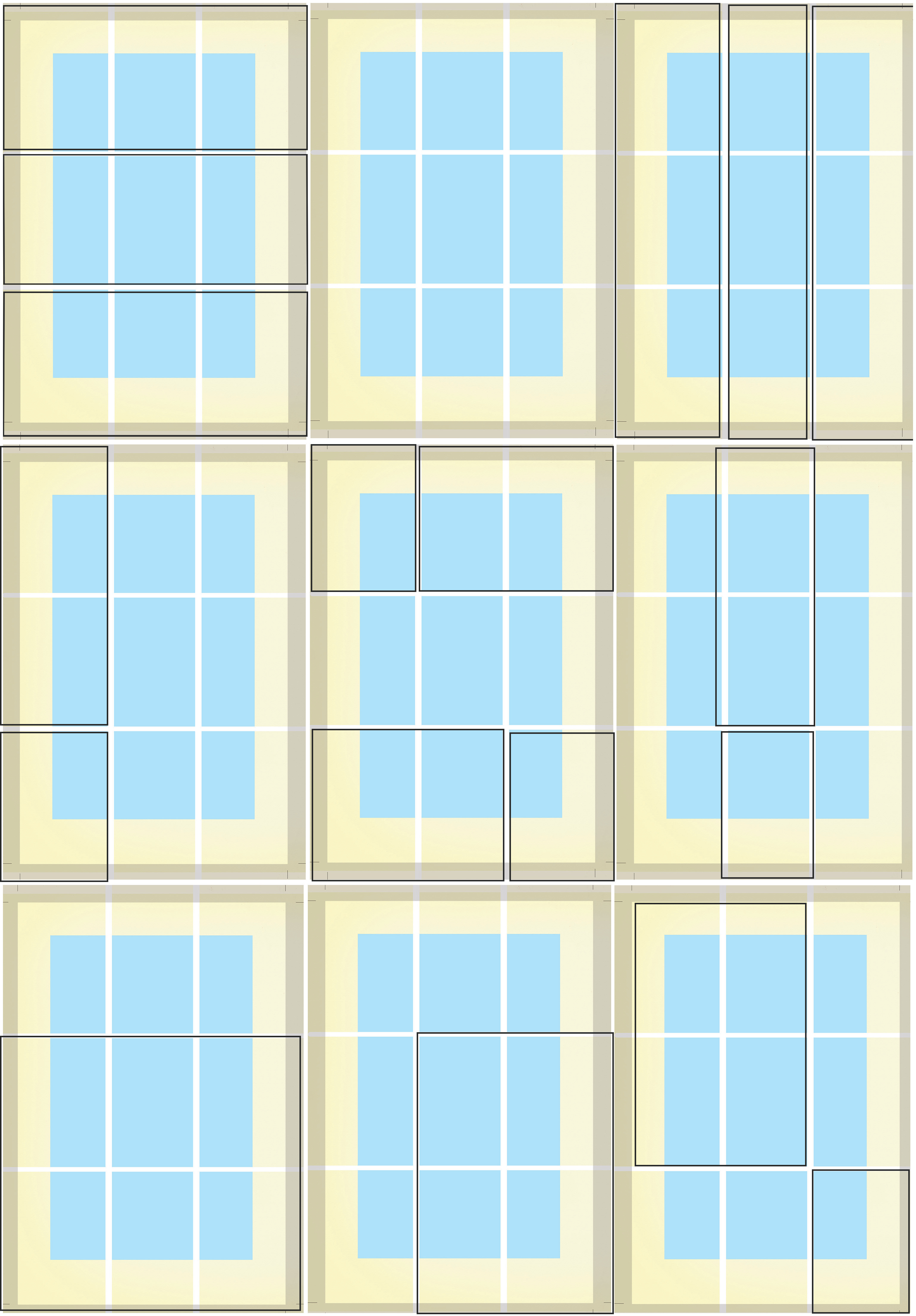
I can divide up my total page area in any number of ways to create panels of differing size and shape, but controlled within these certain variables, as are allowed within the restriction of the prevailing grid. Instead of complicating Page Layout, this can and does in fact make the decision-making behind it, as well as the control of it, simpler and easier. And when I say control, I mean that you can better govern the tempo and pacing of your storyline. The restriction actually allows you to become more inventive.
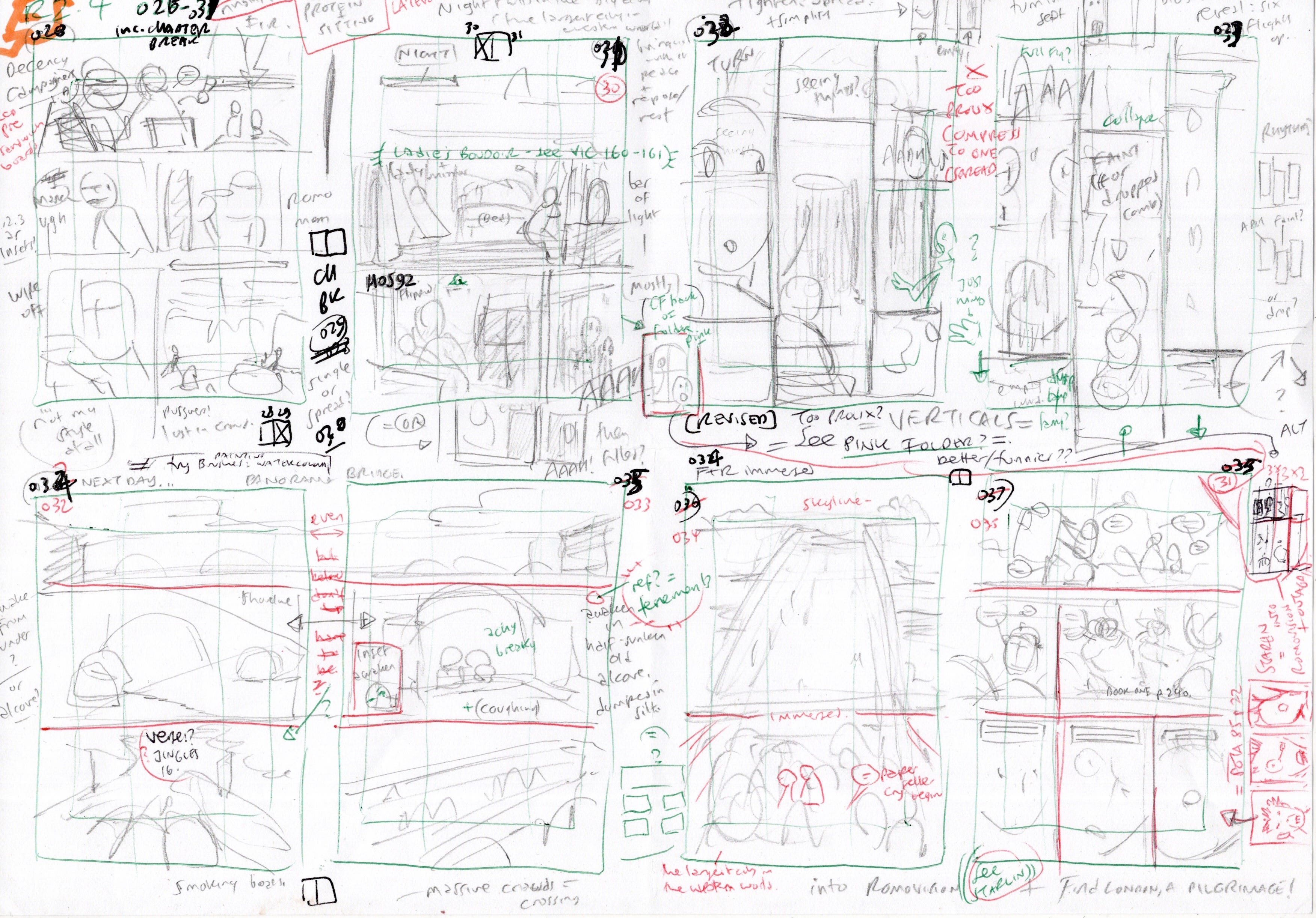
Now I don’t expect anyone but me to be able to make out let alone understand these following images, but here are 3 sequences of 8 pages per sheet laid out as thumbnails on A4 copier paper. Mostly I remember to conform to the strictures of my Grid, drawn in faintly each time, but not always - that gets fixed when I come to lay out my artwork pages at full size however as the same template file is beneath every single one.
Pages 032 and 033 here (top row centre right and far right) get majorly revised from what’s here, so these are very much working drawings, or scribbles - the raw act of storytelling that I probably, out of everything in making a comic, enjoy the most.
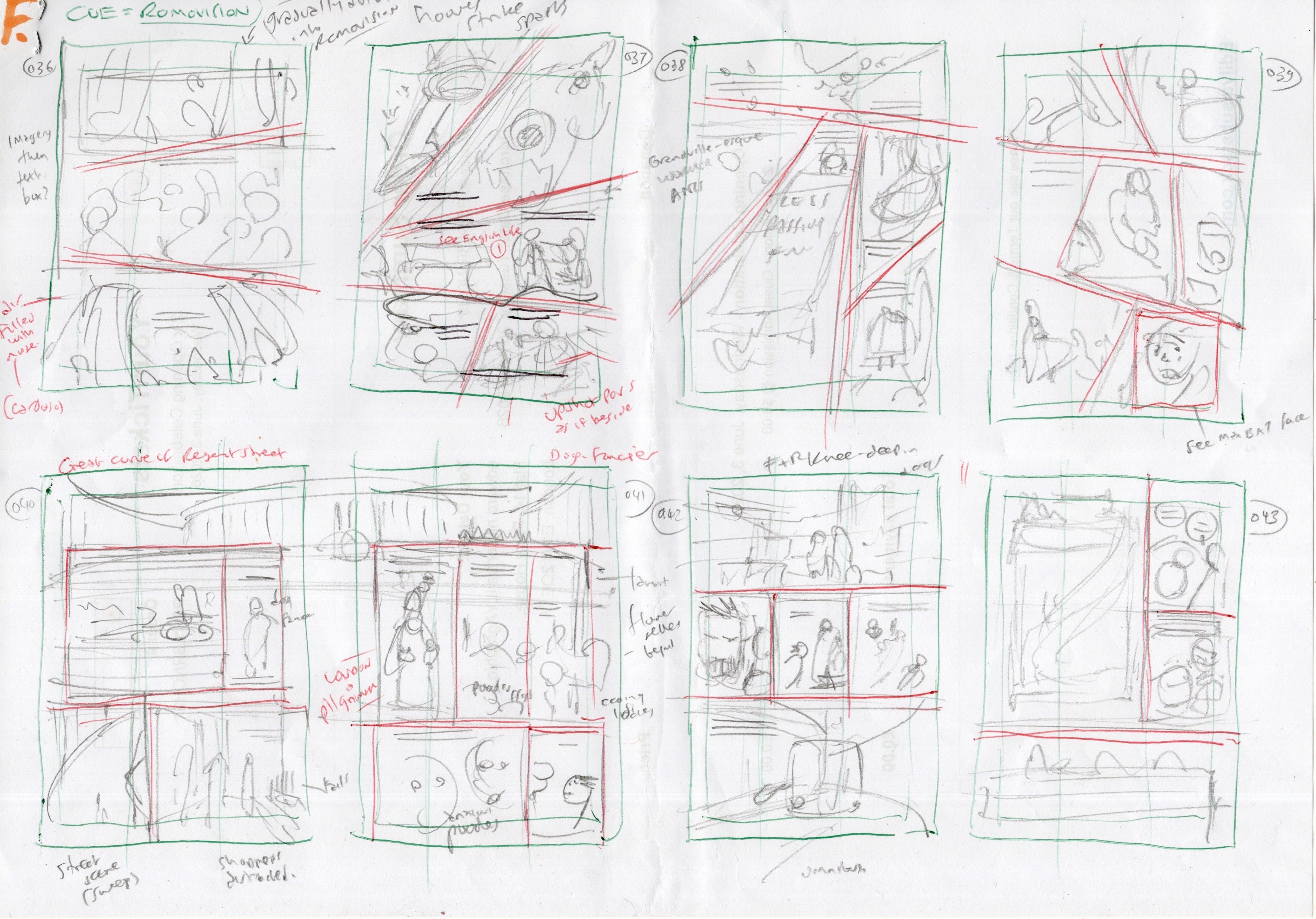
Here you can probably spot that my layout temporarily deviates from the strict parallels of the Grid and goes hog wild. That’s because this sequence will be the ‘ROMOvision’ scene for this second book - as if seen and experienced from ROMO the WolfBoy’s own Point of View or POV. Book One opened with just such a sequence, if arrived at by differing techniques (on that occasion drawn direct in pure coloured pencils). Every volume of ROMO as a series will feature at least one more experimental sequence like these, of ‘ROMOvision’ - it’s important the reader gets to see the world through his eyes or more correctly his emotional responses, and thereby further empathises with or imprints oh him. And this one here’s going to be a doozy!
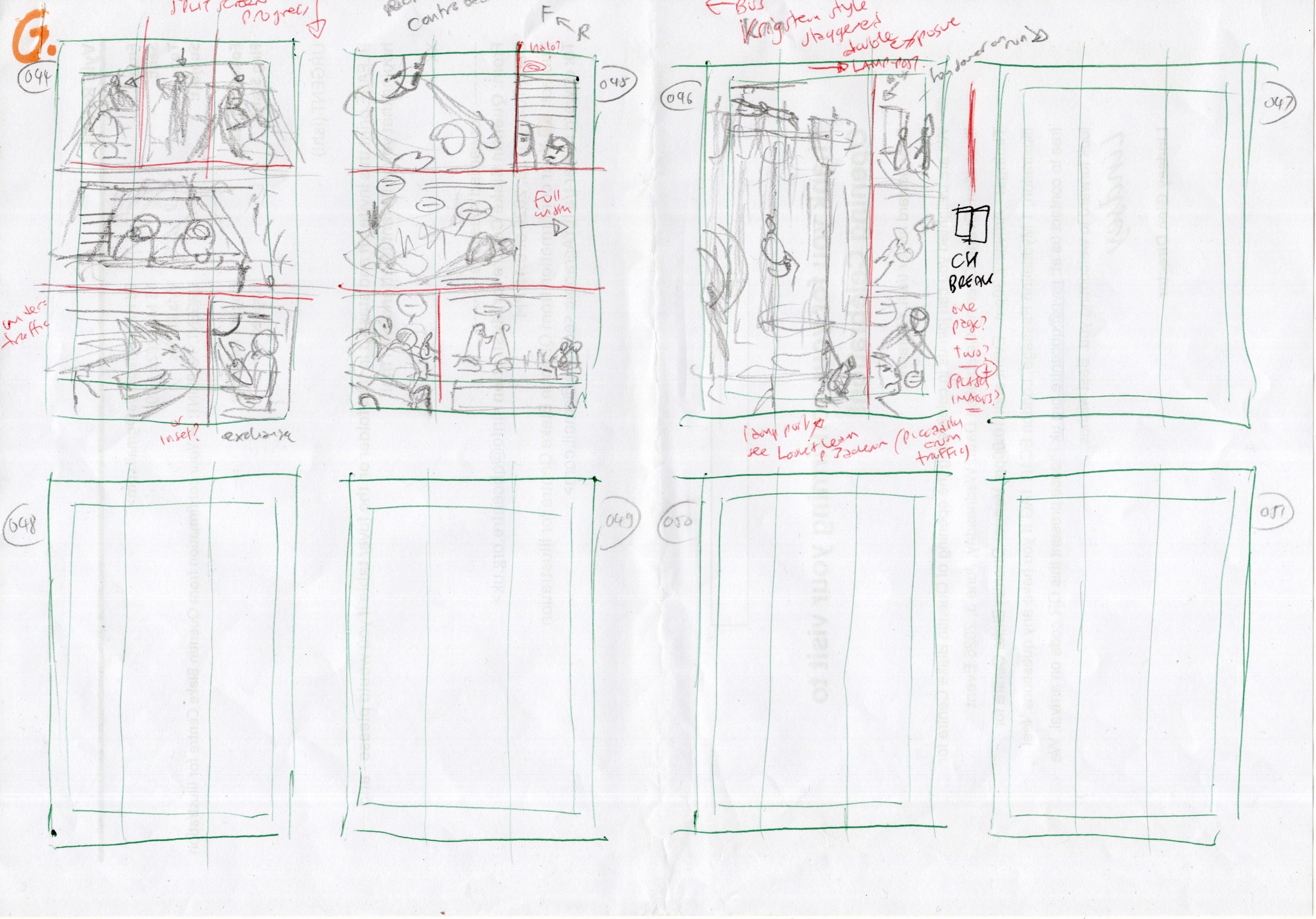
This last takes us up to date. It’s as far as I’ve currently got, although I’m scripting and mapping out my scenes well ahead of here, if in a suitably loose and organic structure.
Is there method to my madness? You bet.
I mean, what in its purest form does this most look like to you…?
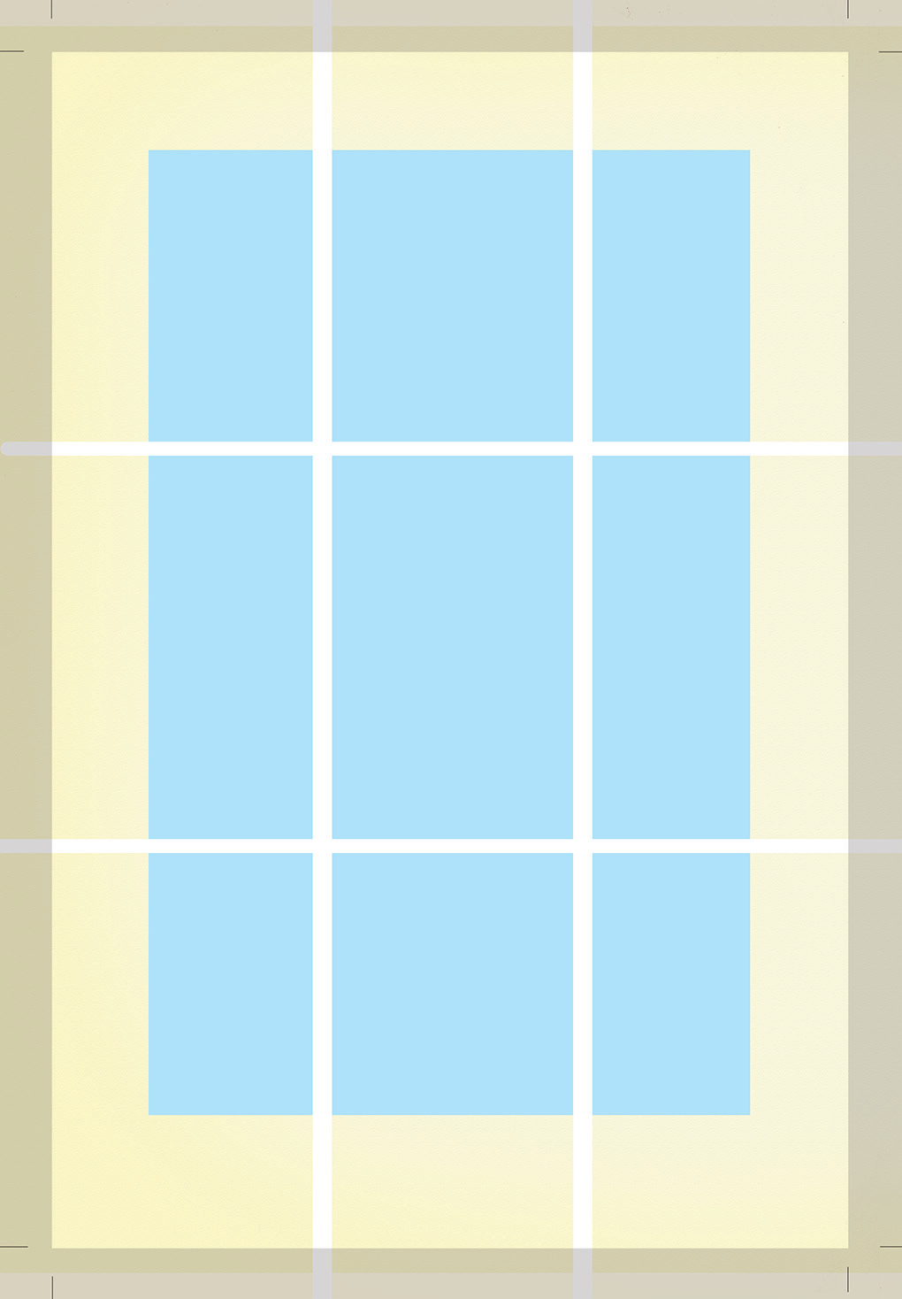
It’s a WINDOW.
And what is this book’s title? ROMO the WolfBoy investigates… The Fall and Rise of Springheeled Tom.
As in a Peeping Tom. Someone who likes to look in and out through windows. You’ll see. I make that very clear at points within the illustrated pages of the book itself.
Just one ickle problem that I can only NOW see clearly here. A bit of a major boo-boo, if I’m honest, given that this grid structure is on file beneath each and every page of my 200+ page new book…
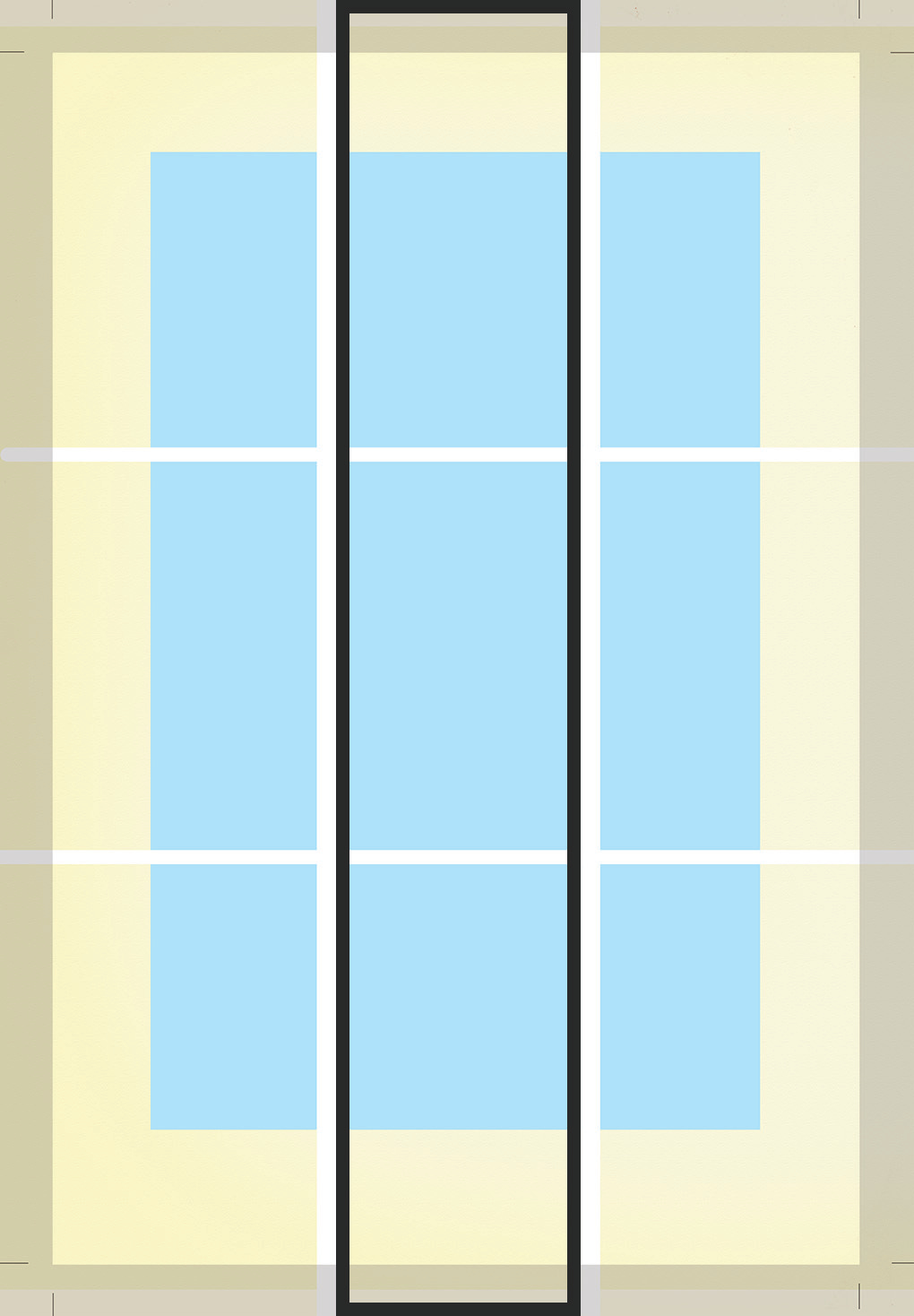
That central section’s too bloody narrow compared to those either side, innit - even once the greyed out area outside of the crops is chopped away!
SacknfrasngnnmmrrrAAGH!
Still, this far in, I’m stuck with it now. Best laid plans of mice and comic artists…
Til Next Time, keep those rulers and pixel counts handy! ILYA X
Mustashrik?! Cool share.
Look again. Centre tier is equal to top and bottom - don't forget the bleed, or maybe it is screen distortion yes. I don't know. Reads as same to me!
Now that's real comics talk! I just found thumbnails I did for Julius Caesar as brush drawings in a square grid (because Kirby, of course) and then broke them down black and white rectangles with a more complex grid. The next act I did all in rectangles with 3 greys and black and white. So this kind of stuff I love. Curious why you made the center tier so much larger then top and bottom? Or is that screen/browser distortion?